pacman::p_load(lubridate, ggthemes, reactable,
reactablefmtr, gt, gtExtras, tidyverse)Hands-on Exercise 10 - Information Dashboard Design: R methods
Overview
By the end of this hands-on exercise, we will be able to:
create bullet chart by using ggplot2,
create sparklines by using ggplot2 ,
build industry standard dashboard by using R Shiny.
Getting started
For the purpose of this hands-on exercise, the following R packages will be used.
Importing database into R
For the purpose of this study, a personal database in Microsoft Access mdb format called Coffee Chain will be used.
In the code chunk below, odbcConnectAccess() of RODBC package is used used to import a database query table into R.
The data set
Importing data
coffeechain <- read_rds("data/rds/CoffeeChain.rds")Data preparation
Aggregate Sales and Budgeted Sales at the Product level.
product <- coffeechain %>%
  group_by(`Product`) %>%
  summarise(`target` = sum(`Budget Sales`),
            `current` = sum(`Sales`)) %>%
  ungroup()
Bullet chart in ggplot2
ggplot(product, aes(Product, current)) +
  geom_col(aes(Product, max(target) * 1.01),
           fill="grey85", width=0.85) +
  geom_col(aes(Product, target * 0.75),
           fill="grey60", width=0.85) +
  geom_col(aes(Product, target * 0.5),
           fill="grey50", width=0.85) +
  geom_col(aes(Product, current),
           width=0.35,
           fill = "black") +
  geom_errorbar(aes(y = target,
                    x = Product,
                    ymin = target,
                    ymax= target),
                width = .4,
                colour = "red",
                size = 1) +
  coord_flip()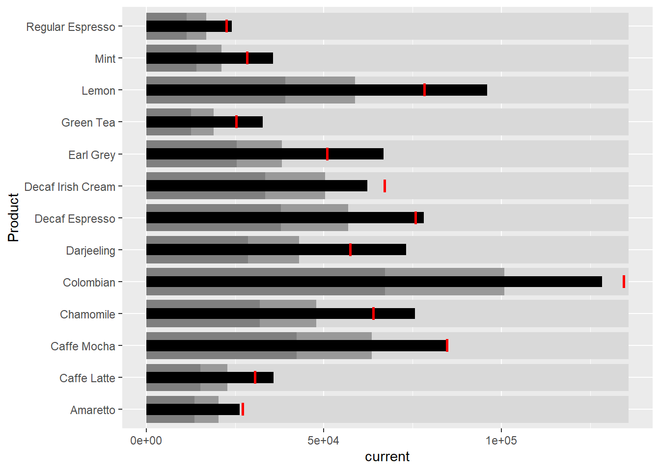
Plotting sparklines using ggplot2
Prepare data
sales_report <- coffeechain %>%
  filter(Date >= "2013-01-01") %>%
  mutate(Month = month(Date)) %>%
  group_by(Month, Product) %>%
  summarise(Sales = sum(Sales)) %>%
  ungroup() %>%
  select(Month, Product, Sales)
Compute the minimum, maximum and end of the month sales:
mins <- group_by(sales_report, Product) %>%
  slice(which.min(Sales))
maxs <- group_by(sales_report, Product) %>%
  slice(which.max(Sales))
ends <- group_by(sales_report, Product) %>%
  filter(Month == max(Month))
Compute the 25 and 75 quantiles:
quarts <- sales_report %>%
  group_by(Product) %>%
  summarise(quart1 = quantile(Sales,
                              0.25),
            quart2 = quantile(Sales,
                              0.75)) %>%
  right_join(sales_report)
Sparklines in ggplot2
ggplot(sales_report, aes(x=Month, y=Sales)) +
  facet_grid(Product ~ ., scales = "free_y") +
  geom_ribbon(data = quarts, aes(ymin = quart1, max = quart2),
              fill = 'grey90') +
  geom_line(size=0.3) +
  geom_point(data = mins, col = 'red') +
  geom_point(data = maxs, col = 'blue') +
  geom_text(data = mins, aes(label = Sales), vjust = -1) +
  geom_text(data = maxs, aes(label = Sales), vjust = 2.5) +
  geom_text(data = ends, aes(label = Sales), hjust = 0, nudge_x = 0.5) +
  geom_text(data = ends, aes(label = Product), hjust = 0, nudge_x = 1.0) +
  expand_limits(x = max(sales_report$Month) +
                  (0.25 * (max(sales_report$Month) - min(sales_report$Month)))) +
  scale_x_continuous(breaks = seq(1, 12, 1)) +
  scale_y_continuous(expand = c(0.1, 0)) +
  theme_tufte(base_size = 3, base_family = "Helvetica") +
  theme(axis.title=element_blank(), axis.text.y = element_blank(),
        axis.ticks = element_blank(), strip.text = element_blank())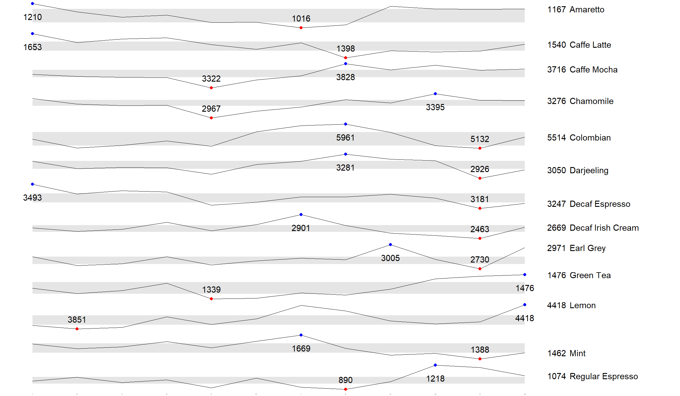
Static Information Dashboard Design: gt and gtExtras methods
Plotting a simple bullet chart
product %>%
  gt::gt() %>%
  gt_plt_bullet(column = current,
              target = target,
              width = 60,
              palette = c("lightblue",
                          "black")) %>%
gt_theme_538()| Product | current |
|---|---|
| Amaretto | |
| Caffe Latte | |
| Caffe Mocha | |
| Chamomile | |
| Colombian | |
| Darjeeling | |
| Decaf Espresso | |
| Decaf Irish Cream | |
| Earl Grey | |
| Green Tea | |
| Lemon | |
| Mint | |
| Regular Espresso |
sparklines: gtExtras method
Prepare data:
report <- coffeechain %>%
  mutate(Year = year(Date)) %>%
  filter(Year == "2013") %>%
  mutate (Month = month(Date,
                        label = TRUE,
                        abbr = TRUE)) %>%
  group_by(Product, Month) %>%
  summarise(Sales = sum(Sales)) %>%
  ungroup()
It is important to note that one of the requirement of gtExtras functions is that almost exclusively they require you to pass data.frame with list columns. In view of this, code chunk below will be used to convert the report data.frame into list columns.
report %>%
  group_by(Product) %>%
  summarize('Monthly Sales' = list(Sales),
            .groups = "drop")
# A tibble: 13 × 2
Product `Monthly Sales`
<chr> <list>
1 Amaretto <dbl [12]>
2 Caffe Latte <dbl [12]>
3 Caffe Mocha <dbl [12]>
4 Chamomile <dbl [12]>
5 Colombian <dbl [12]>
6 Darjeeling <dbl [12]>
7 Decaf Espresso <dbl [12]>
8 Decaf Irish Cream <dbl [12]>
9 Earl Grey <dbl [12]>
10 Green Tea <dbl [12]>
11 Lemon <dbl [12]>
12 Mint <dbl [12]>
13 Regular Espresso <dbl [12]> Plotting coffee chain sales report
report %>%
  group_by(Product) %>%
  summarize('Monthly Sales' = list(Sales),
            .groups = "drop") %>%
   gt() %>%
   gt_plt_sparkline('Monthly Sales',
same_limit = FALSE)| Product | Monthly Sales |
|---|---|
| Amaretto | |
| Caffe Latte | |
| Caffe Mocha | |
| Chamomile | |
| Colombian | |
| Darjeeling | |
| Decaf Espresso | |
| Decaf Irish Cream | |
| Earl Grey | |
| Green Tea | |
| Lemon | |
| Mint | |
| Regular Espresso |
Adding statistics
Calculate summary statistics:
report %>%
  group_by(Product) %>%
  summarise("Min" = min(Sales, na.rm = T),
            "Max" = max(Sales, na.rm = T),
            "Average" = mean(Sales, na.rm = T)
            ) %>%
  gt() %>%
  fmt_number(columns = 4,
decimals = 2)| Product | Min | Max | Average |
|---|---|---|---|
| Amaretto | 1016 | 1210 | 1,119.00 |
| Caffe Latte | 1398 | 1653 | 1,528.33 |
| Caffe Mocha | 3322 | 3828 | 3,613.92 |
| Chamomile | 2967 | 3395 | 3,217.42 |
| Colombian | 5132 | 5961 | 5,457.25 |
| Darjeeling | 2926 | 3281 | 3,112.67 |
| Decaf Espresso | 3181 | 3493 | 3,326.83 |
| Decaf Irish Cream | 2463 | 2901 | 2,648.25 |
| Earl Grey | 2730 | 3005 | 2,841.83 |
| Green Tea | 1339 | 1476 | 1,398.75 |
| Lemon | 3851 | 4418 | 4,080.83 |
| Mint | 1388 | 1669 | 1,519.17 |
| Regular Espresso | 890 | 1218 | 1,023.42 |
Combining the data frame
spark <- report %>%
  group_by(Product) %>%
  summarize('Monthly Sales' = list(Sales),
            .groups = "drop")

sales <- report %>%
  group_by(Product) %>%
  summarise("Min" = min(Sales, na.rm = T),
            "Max" = max(Sales, na.rm = T),
            "Average" = mean(Sales, na.rm = T)
            )

sales_data = left_join(sales, spark)
Plot updated data.table
sales_data %>%
  gt() %>%
  gt_plt_sparkline('Monthly Sales',
same_limit = FALSE)| Product | Min | Max | Average | Monthly Sales |
|---|---|---|---|---|
| Amaretto | 1016 | 1210 | 1119.000 | |
| Caffe Latte | 1398 | 1653 | 1528.333 | |
| Caffe Mocha | 3322 | 3828 | 3613.917 | |
| Chamomile | 2967 | 3395 | 3217.417 | |
| Colombian | 5132 | 5961 | 5457.250 | |
| Darjeeling | 2926 | 3281 | 3112.667 | |
| Decaf Espresso | 3181 | 3493 | 3326.833 | |
| Decaf Irish Cream | 2463 | 2901 | 2648.250 | |
| Earl Grey | 2730 | 3005 | 2841.833 | |
| Green Tea | 1339 | 1476 | 1398.750 | |
| Lemon | 3851 | 4418 | 4080.833 | |
| Mint | 1388 | 1669 | 1519.167 | |
| Regular Espresso | 890 | 1218 | 1023.417 |
Combining bullet chart and sparklines
bullet <- coffeechain %>%
  filter(Date >= "2013-01-01") %>%
  group_by(`Product`) %>%
  summarise(`Target` = sum(`Budget Sales`),
            `Actual` = sum(`Sales`)) %>%
  ungroup()

sales_data = sales_data %>%
  left_join(bullet)

sales_data %>%
  gt() %>%
  gt_plt_sparkline('Monthly Sales') %>%
  gt_plt_bullet(column = Actual,
                target = Target,
                width = 28,
                palette = c("lightblue",
                          "black")) %>%
gt_theme_538()| Product | Min | Max | Average | Monthly Sales | Actual |
|---|---|---|---|---|---|
| Amaretto | 1016 | 1210 | 1119.000 | ||
| Caffe Latte | 1398 | 1653 | 1528.333 | ||
| Caffe Mocha | 3322 | 3828 | 3613.917 | ||
| Chamomile | 2967 | 3395 | 3217.417 | ||
| Colombian | 5132 | 5961 | 5457.250 | ||
| Darjeeling | 2926 | 3281 | 3112.667 | ||
| Decaf Espresso | 3181 | 3493 | 3326.833 | ||
| Decaf Irish Cream | 2463 | 2901 | 2648.250 | ||
| Earl Grey | 2730 | 3005 | 2841.833 | ||
| Green Tea | 1339 | 1476 | 1398.750 | ||
| Lemon | 3851 | 4418 | 4080.833 | ||
| Mint | 1388 | 1669 | 1519.167 | ||
| Regular Espresso | 890 | 1218 | 1023.417 |
Interactive Information Dashboard Design: reactable and reactablefmtr methods
Load package
remotes::install_github("timelyportfolio/dataui")library(dataui)Plotting interactive sparklines
# Prepare list field
report <- report %>%
  group_by(Product) %>%
  summarize(`Monthly Sales` = list(Sales))

# Plot sparklines
reactable(
  report,
  columns = list(
    Product = colDef(maxWidth = 200),
    `Monthly Sales` = colDef(
      cell = react_sparkline(report)
    )
  )
)
Changing the page size
Default page size is 10, we can change it as follows:
reactable(
  report,
  defaultPageSize = 13, # Change page size
  columns = list(
    Product = colDef(maxWidth = 200),
    `Monthly Sales` = colDef(
      cell = react_sparkline(report)
    )
  )
)
Adding points and labels
highlight_points argument is used to show the minimum and maximum values points and label argument is used to label first and last values:
reactable(
  report,
  defaultPageSize = 13,
  columns = list(
    Product = colDef(maxWidth = 200),
    `Monthly Sales` = colDef(
      cell = react_sparkline(
        report,
        highlight_points = highlight_points(
          min = "red", max = "blue"),
        labels = c("first", "last")
        )
    )
  )
)
Adding reference line
statline argument is used to show the mean line:
reactable(
  report,
  defaultPageSize = 13,
  columns = list(
    Product = colDef(maxWidth = 200),
    `Monthly Sales` = colDef(
      cell = react_sparkline(
        report,
        highlight_points = highlight_points(
          min = "red", max = "blue"),
        statline = "mean"
        )
    )
  )
)
Adding bandline
reactable(
  report,
  defaultPageSize = 13,
  columns = list(
    Product = colDef(maxWidth = 200),
    `Monthly Sales` = colDef(
      cell = react_sparkline(
        report,
        highlight_points = highlight_points(
          min = "red", max = "blue"),
        line_width = 1,
        bandline = "innerquartiles",
        bandline_color = "green"
        )
    )
  )
)
Changing from sparkline to sparkbar
reactable(
  report,
  defaultPageSize = 13,
  columns = list(
    Product = colDef(maxWidth = 200),
    `Monthly Sales` = colDef(
      cell = react_sparkbar(
        report,
        highlight_bars = highlight_bars(
          min = "red", max = "blue"),
        bandline = "innerquartiles",
        statline = "mean")
    )
  )
)
References
Main reference: Kam, T.S. (2024). Information Dashboard Design: R methods