pacman::p_load(ggdist, ggridges, ggthemes,
colorspace, tidyverse)Hands-on Exercise 4a - Visualising Distribution
4.1 Learning Outcome
In this chapter, we will learn two new statistical graphic methods for visualising distribution, namely ridgeline plot and raincloud plot
4.2 Getting Started
4.2.1 Loading R package
The following R packages will be used:
tidyverse, a family of R packages for data science processes,
ggridges, a ggplot2 extension specially designed for plotting ridgeline plots, and
ggdist for visualising distribution and uncertainty.
4.2.2 Importing data
exam <- read_csv("data/Exam_data.csv")4.3 Visualising Distribution with Ridgeline plots
Ridgeline plot (sometimes called Joyplot) is a data visualisation technique for revealing the distribution of a numeric value for several groups.
Figure below is a ridgelines plot showing the distribution of English score by class.
Show the code
ggplot(exam,
       aes(x = ENGLISH,
           y = CLASS)) +
  geom_density_ridges(
    scale = 3,
    rel_min_height = 0.01,
    bandwidth = 3.4,
    fill = lighten("grey", .3),
    color = "black"
  ) +
  scale_x_continuous(
    name = "ENGLISH",
    expand = c(0, 0)
    ) +
  scale_y_discrete(name = "CLASS", expand = expansion(add = c(0.2, 2.6))) +
  theme_ridges()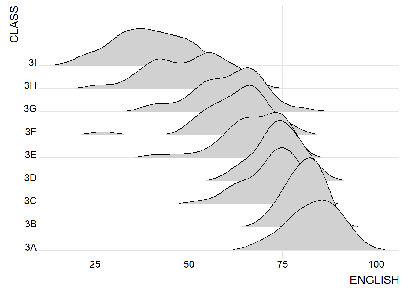
Note
Ridgeline plots make sense when the number of group to represent is medium to high, and thus a classic window separation would take to much space.
It works well when there is a clear pattern in the result, like if there is an obvious ranking in groups. Otherwise group will tend to overlap each other, leading to a messy plot not providing any insight.
4.3.1 Plotting ridgeline graph: ggridges method
Here, we will plot ridgeline plots using ggridges package.
There are 2 main geoms to plot ridgeline plots: geom_ridgeline() and geom_density_ridges().
The former takes height values directly to draw the ridgelines, and the latter first estimates data densities and then draws those using ridgelines.
The ridgeline plot below is plotted by using geom_density_ridges().
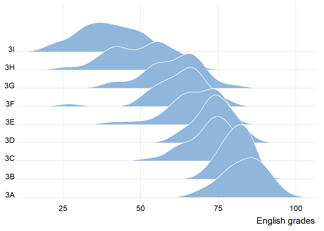
ggplot(exam,
       aes(x = ENGLISH,
           y = CLASS)) +
  geom_density_ridges(
    scale = 3,
    rel_min_height = 0.01,
    bandwidth = 3.4,
    fill = lighten("#7097BB", .3),
    color = "white"
  ) +
  scale_x_continuous(
    name = "English grades",
    expand = c(0, 0)
    ) +
  scale_y_discrete(name = NULL, expand = expansion(add = c(0.2, 2.6))) +
  theme_ridges()
4.3.2 Varying fill colours along the x axis
We can have the area under a ridgeline filled with colors that vary along the x axis. This effect can be achieved by using either geom_ridgeline_gradient() or geom_density_ridges_gradient(). Both geoms work just like geom_ridgeline() and geom_density_ridges(), except that they allow for varying fill colors. However, they do not allow for alpha transparency in the fill.
We can have changing fill colors OR transparency but not both.
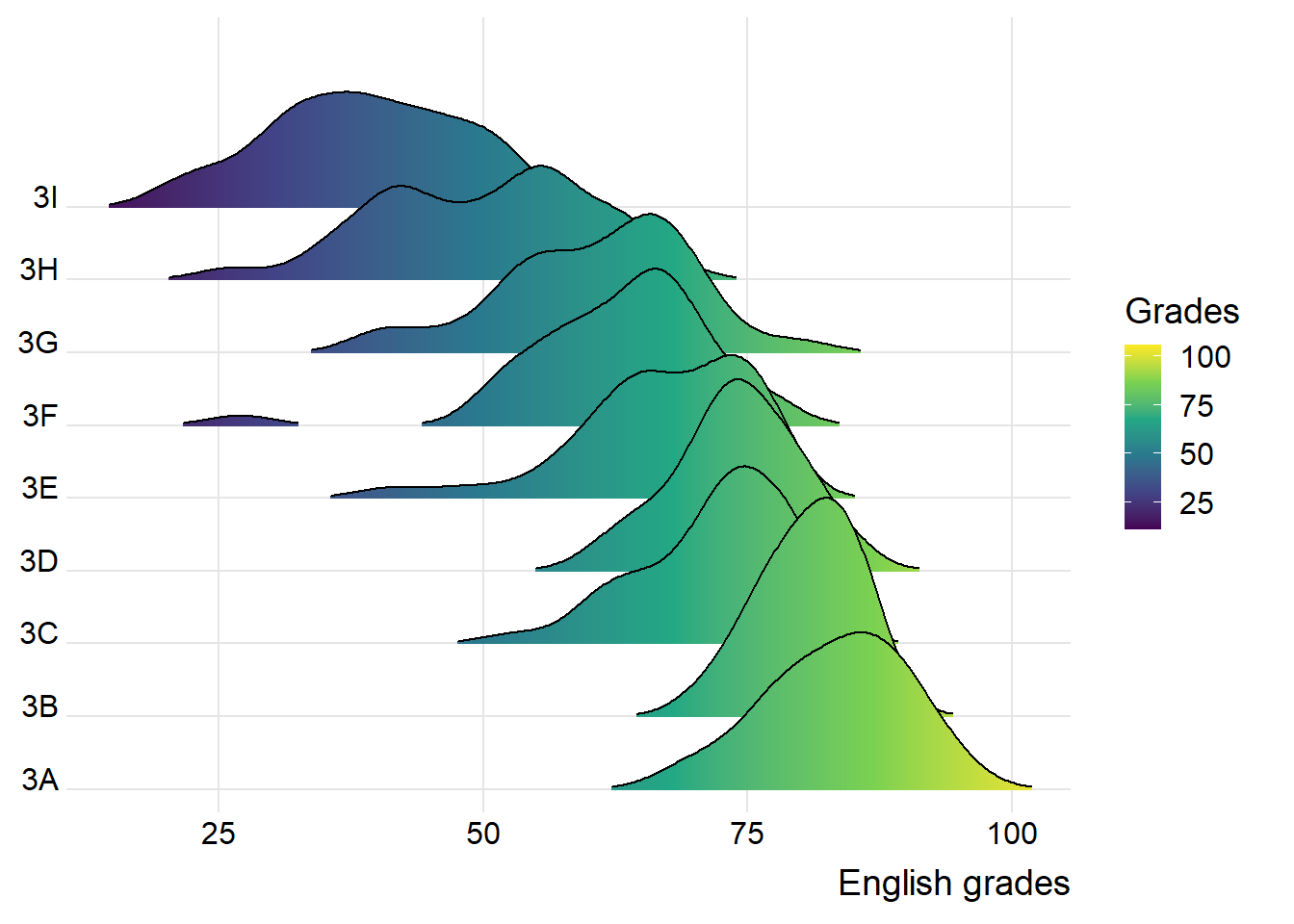
ggplot(exam,
       aes(x = ENGLISH,
           y = CLASS,
           fill = stat(x))) +
  geom_density_ridges_gradient(
    scale = 3,
    rel_min_height = 0.01) +
  scale_fill_viridis_c(name = "Grades",
                       option = "D") +
  scale_x_continuous(
    name = "English grades",
    expand = c(0, 0)
  ) +
  scale_y_discrete(name = NULL, expand = expansion(add = c(0.2, 2.6))) +
  theme_ridges()
4.3.2 Mapping the probabilities directly onto colour
ggridges package also provides a stat function called stat_density_ridges() that replaces stat_density() of ggplot2.
Figure below is plotted by mapping the probabilities calculated by using stat(ecdf) which represent the empirical cumulative density function for the distribution of English score.
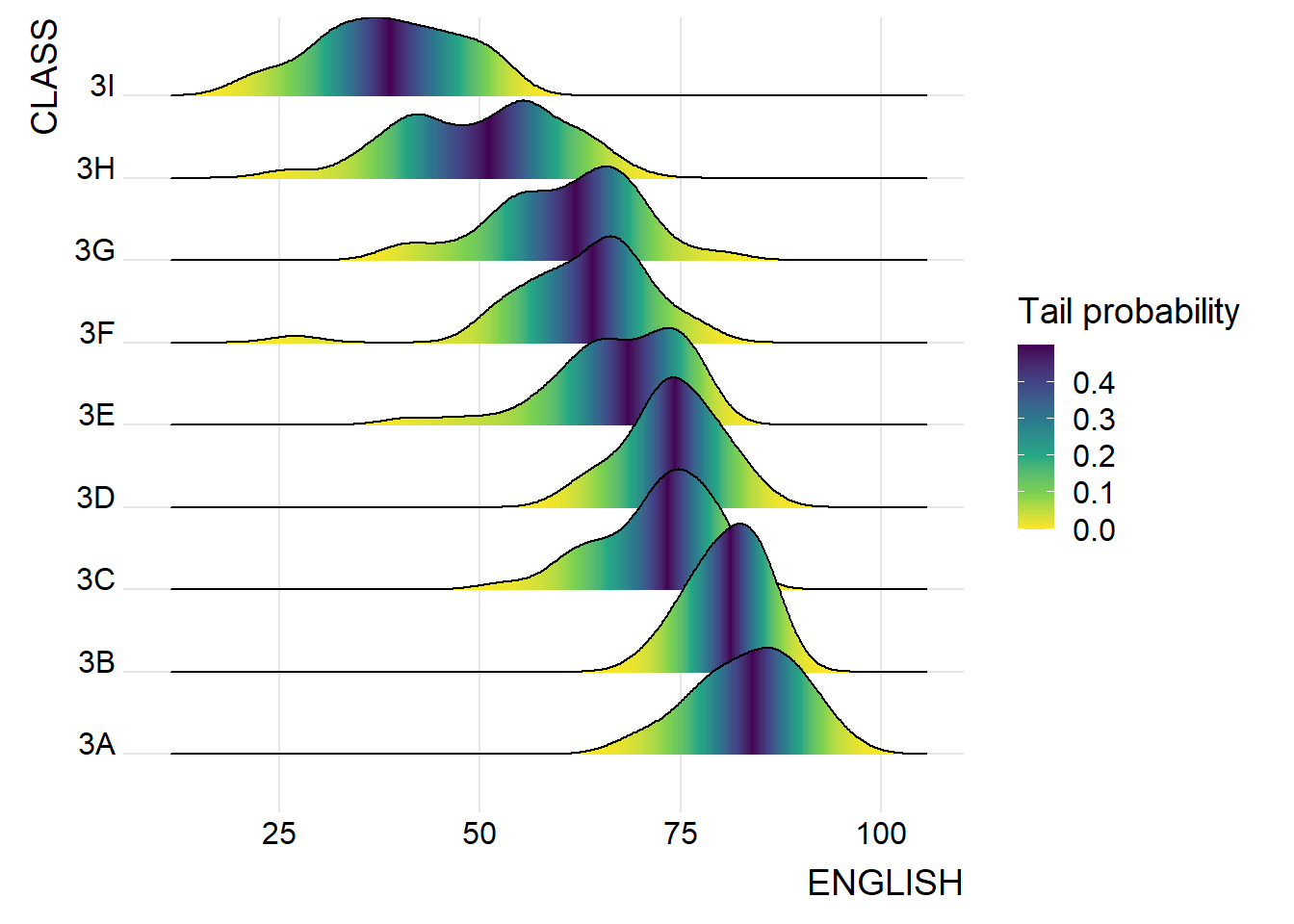
ggplot(exam,
       aes(x = ENGLISH,
           y = CLASS,
           fill = 0.5 - abs(0.5-stat(ecdf)))) +
  stat_density_ridges(geom = "density_ridges_gradient",
                      calc_ecdf = TRUE) +
  scale_fill_viridis_c(name = "Tail probability",
                       direction = -1) +
  theme_ridges()
Important
It is important include the argument calc_ecdf = TRUE in stat_density_ridges().
4.3.4 Ridgeline plots with quantile lines
By using geom_density_ridges_gradient(), we can colour the ridgeline plot by quantile, via the calculated stat(quantile) aesthetic as shown in the figure below.
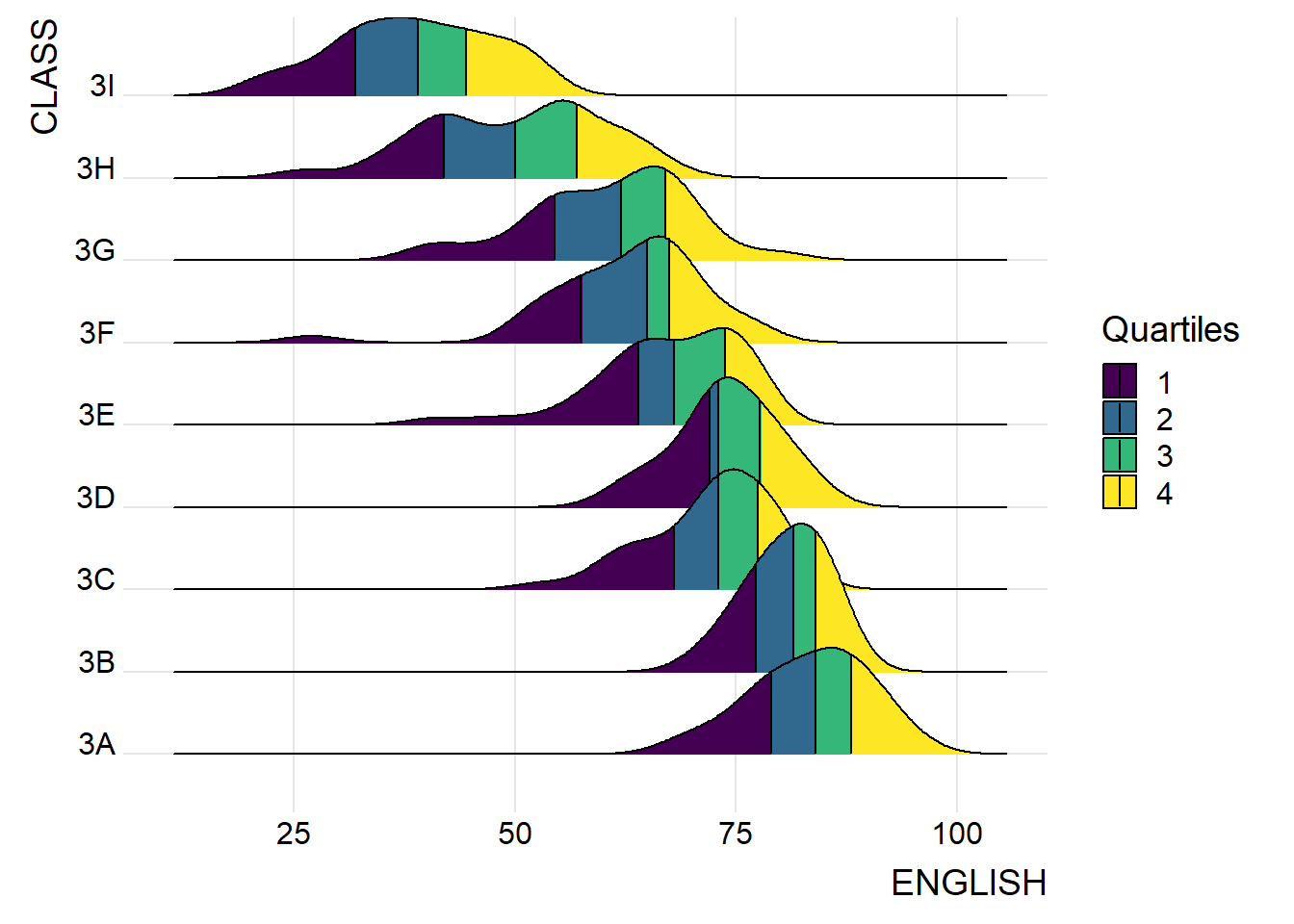
ggplot(exam,
       aes(x = ENGLISH,
           y = CLASS,
           fill = factor(stat(quantile))
           )) +
  stat_density_ridges(
    geom = "density_ridges_gradient",
    calc_ecdf = TRUE,
    quantiles = 4,
    quantile_lines = TRUE) +
  scale_fill_viridis_d(name = "Quartiles") +
  theme_ridges()
We can also specify quantiles by cut points such as 2.5% and 97.5% tails to colour the ridgeline plot as shown in the figure below.
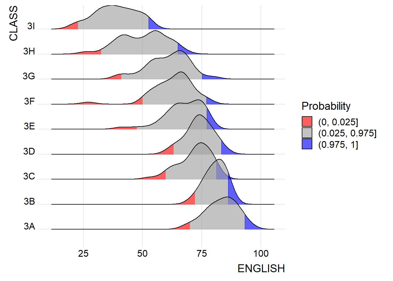
ggplot(exam,
       aes(x = ENGLISH,
           y = CLASS,
           fill = factor(stat(quantile))
           )) +
  stat_density_ridges(
    geom = "density_ridges_gradient",
    calc_ecdf = TRUE,
    quantiles = c(0.025, 0.975)
    ) +
  scale_fill_manual(
    name = "Probability",
    values = c("#FF0000A0", "#A0A0A0A0", "#0000FFA0"),
    labels = c("(0, 0.025]", "(0.025, 0.975]", "(0.975, 1]")
  ) +
  theme_ridges()
4.4 Visualising Distribution with Rain cloud plots
Raincloud Plot is a data visualisation techniques that produces a half-density to a distribution plot.
The raincloud (half-density) plot enhances the traditional box-plot by highlighting multiple modalities (an indicator that groups may exist). The boxplot does not show where densities are clustered, but the raincloud plot does!
We will use functions provided by ggdist and ggplot2 packages.
4.4.1 Plotting a Half Eye graph
First, we will plot a Half-Eye graph by using stat_halfeye() of ggdist package.
This produces a Half Eye visualization, which is contains a half-density and a slab-interval.
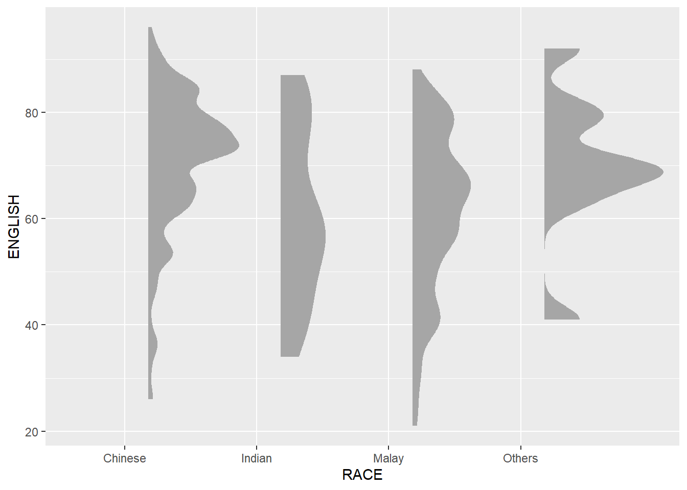
ggplot(exam,
       aes(x = RACE,
           y = ENGLISH)) +
  stat_halfeye(adjust = 0.5,
               justification = -0.2,
               .width = 0,
               point_colour = NA)
Things to learn from the code above
We remove the slab interval by setting .width = 0 and point_colour = NA.
9.4.2 Adding the boxplot with geom_boxplot()
Next, we will add the second geometry layer using geom_boxplot() of ggplot2. This produces a narrow boxplot. We reduce the width and adjust the opacity.
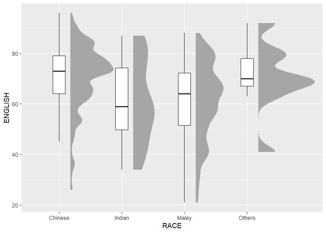
ggplot(exam,
       aes(x = RACE,
           y = ENGLISH)) +
  stat_halfeye(adjust = 0.5,
               justification = -0.2,
               .width = 0,
               point_colour = NA) +
  geom_boxplot(width = .20,
               outlier.shape = NA)
4.4.3 Adding the Dot Plots with stat_dots()
Next, we will add the third geometry layer using stat_dots() of ggdist package. This produces a half-dotplot, which is similar to a histogram that indicates the number of samples (number of dots) in each bin. We select side = “left” to indicate we want it on the left-hand side.
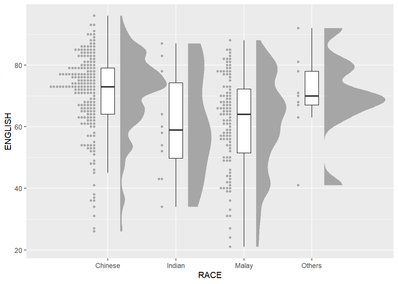
ggplot(exam,
       aes(x = RACE,
           y = ENGLISH)) +
  stat_halfeye(adjust = 0.5,
               justification = -0.2,
               .width = 0,
               point_colour = NA) +
  geom_boxplot(width = .20,
               outlier.shape = NA) +
  stat_dots(side = "left",
            justification = 1.2,
            binwidth = .5,
            dotsize = 2)
4.4.2 Finishing Touch
Lastly, coord_flip() of ggplot2 package will be used to flip the raincloud chart horizontally to give it the raincloud appearance. At the same time, theme_economist() of ggthemes package is used to give the raincloud chart a professional publishing standard look.
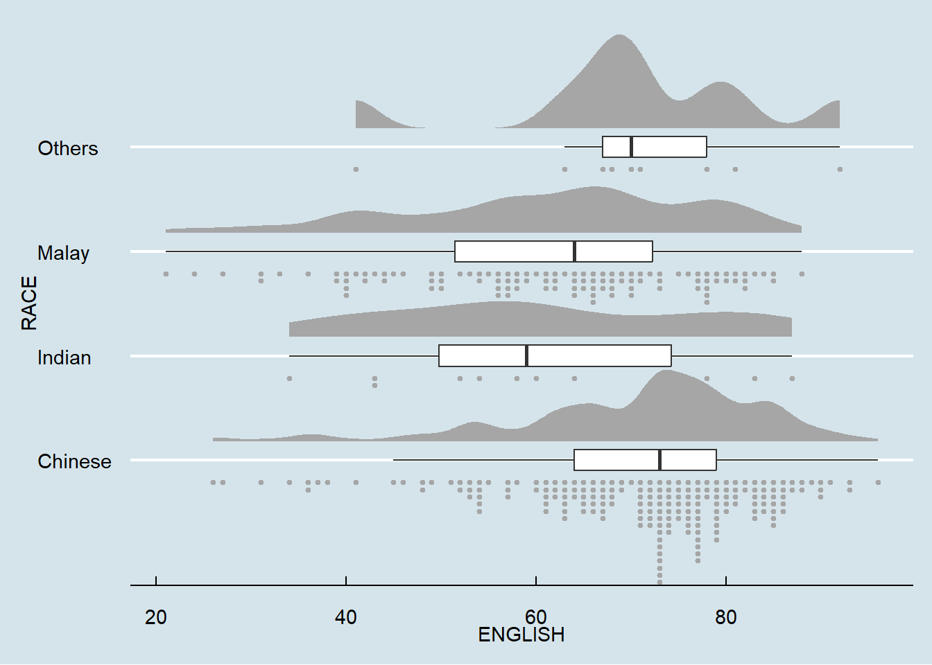
ggplot(exam,
       aes(x = RACE,
           y = ENGLISH)) +
  stat_halfeye(adjust = 0.5,
               justification = -0.2,
               .width = 0,
               point_colour = NA) +
  geom_boxplot(width = .20,
               outlier.shape = NA) +
  stat_dots(side = "left",
            justification = 1.2,
            binwidth = .5,
            dotsize = 1.5) +
  coord_flip() +
  theme_economist()
4.5 Plotting Practise
1) Differences in distribution of genders in classes
Show the code
ggplot(exam,
       aes(x = ENGLISH,
           y = interaction(CLASS, GENDER),
         fill = GENDER)) +
  geom_density_ridges(
    scale = 3,
    rel_min_height = 0.01,
    bandwidth = 3.4,
    color = "black"
  ) +
  scale_x_continuous(
    name = "ENGLISH",
    expand = c(0, 0)
    ) +
  scale_y_discrete(name = "Genders per class", expand = expansion(add = c(0.2, 2.6))) +
  scale_fill_manual(values = c("Male" = "lightblue", "Female" = "lightpink")) +
  theme_ridges() +
  theme(legend.position = "none")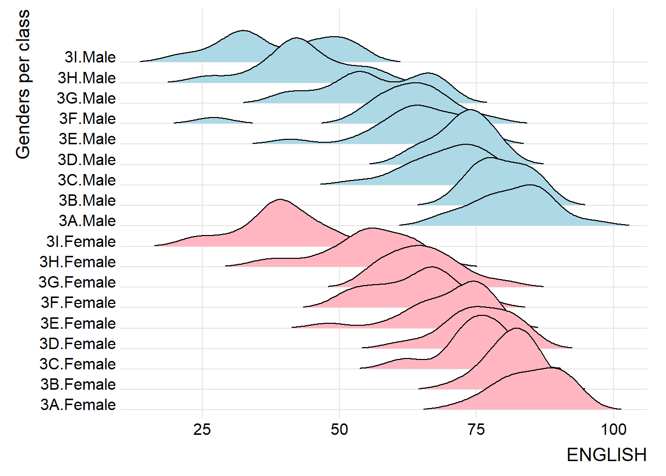
2) Specify quantiles by cut points such as 2.5% and 97.5% tails to colour the ridgeline plot
Show the code
ggplot(exam,
       aes(x = ENGLISH,
           y = interaction(CLASS, GENDER),
           fill = factor(stat(quantile))
           )) +
  stat_density_ridges(
    geom = "density_ridges_gradient",
    calc_ecdf = TRUE,
    quantiles = c(0.025, 0.975)
    ) +
  scale_fill_manual(
    name = "Probability",
    values = c("#FF0000A0", "#A0A0A0A0", "#0000FFA0"),
    labels = c("(0, 0.025]", "(0.025, 0.975]", "(0.975, 1]")
  ) +
  labs(y=NULL) +
  theme_ridges() +
  theme(legend.position = "bottom")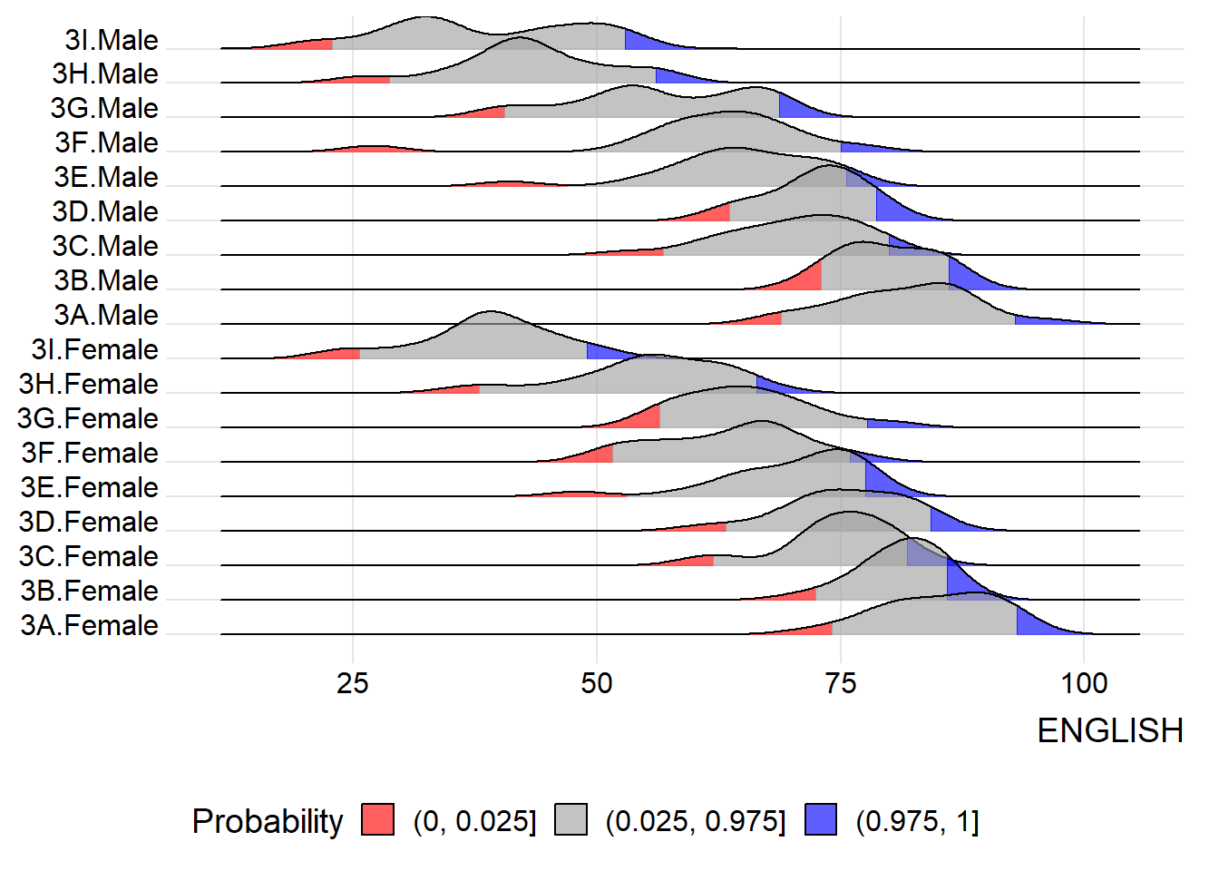
3) Half-eye with box plot
Show the code
ggplot(exam,
       aes(x = RACE,
           y = ENGLISH)) +
  stat_halfeye(adjust = 0.5,
               justification = -0.2,
               .width = 0,
               point_colour = NA) +
  geom_boxplot(width = .20,
               outlier.shape = NA) +
  coord_flip() +
  theme_fivethirtyeight()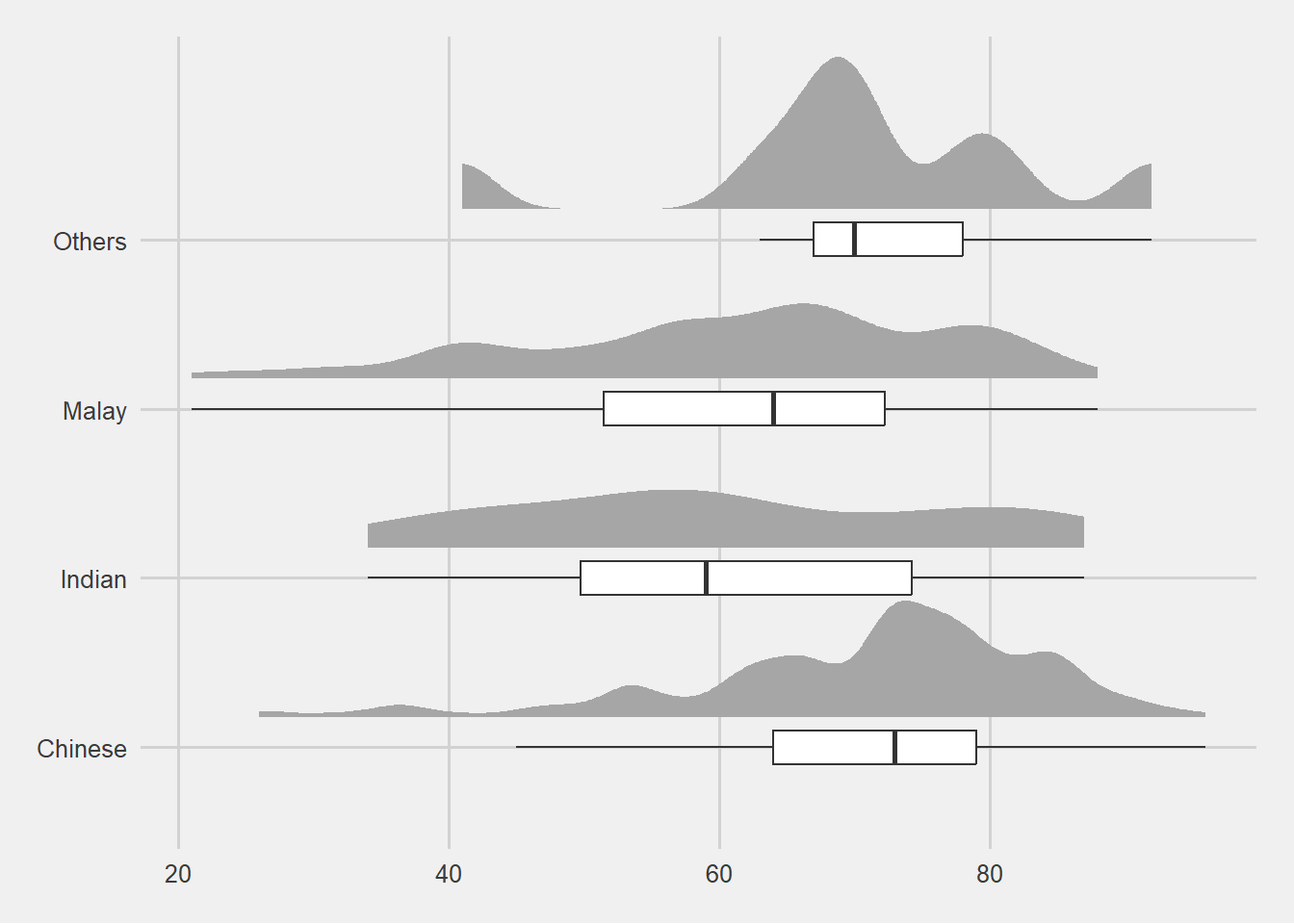
4.6 References
Main reference: Kam, T.S. (2024). Visualising Distribution.