pacman::p_load(scales, viridis, lubridate, ggthemes,
               gridExtra, readxl, knitr, data.table,
tidyverse, CGPfunctions)Hands-on Exercise 6 - Visualising and Analysing Time-oriented Data
6.1 Learning Outcome
In this hands-on exercise, we will be creating the followings data visualisation by using R packages:
plotting a calender heatmap by using ggplot2 functions,
plotting a cycle plot by using ggplot2 function,
plotting a slopegraph
plotting a horizon chart
6.1.1 Loading R packages
6.2 Importing Data and Data Preparation
We will use the code below to import eventlog.csv into our R environment.
attacks <- read_csv("data/eventlog.csv")6.2.1 Examining the data structure
We will use kable() to review the structure of the imported data frame.
kable(head(attacks))| timestamp | source_country | tz |
|---|---|---|
| 2015-03-12 15:59:16 | CN | Asia/Shanghai |
| 2015-03-12 16:00:48 | FR | Europe/Paris |
| 2015-03-12 16:02:26 | CN | Asia/Shanghai |
| 2015-03-12 16:02:38 | US | America/Chicago |
| 2015-03-12 16:03:22 | CN | Asia/Shanghai |
| 2015-03-12 16:03:45 | CN | Asia/Shanghai |
There are three columns, namely timestamp, source_country and tz.
timestamp field stores date-time values in POSIXct format.
source_country field stores the source of the attack. It is in ISO 3166-1 alpha-2 country code.
tz field stores time zone of the source IP address.
6.2.2 Data Preparation
Step 1: Deriving weekday and hour of day fields
Before we can plot the calender heatmap, two new fields namely wkday and hour will need to be derived.
We will write a function to perform the task.
make_hr_wkday <- function(ts, sc, tz) {
  real_times <- ymd_hms(ts,
                        tz = tz[1],
                        quiet = TRUE)
  dt <- data.table(source_country = sc,
                   wkday = weekdays(real_times),
                   hour = hour(real_times))
  return(dt)
  }
Note
weekdays()is a base R function.
Step 2: Deriving the attacks tibble data frame
wkday_levels <- c('Saturday', 'Friday',
                  'Thursday', 'Wednesday',
                  'Tuesday', 'Monday',
                  'Sunday')

attacks <- attacks %>%
  group_by(tz) %>%
  do(make_hr_wkday(.$timestamp,
                   .$source_country,
                   .$tz)) %>%
  ungroup() %>%
  mutate(wkday = factor(
    wkday, levels = wkday_levels),
    hour  = factor(
      hour, levels = 0:23))
Note
Beside extracting the necessary data into attacks data frame, mutate() of dplyr package is used to convert wkday and hour fields into factor so they’ll be ordered when plotting
Table below shows the tibble table after processing.
kable(head(attacks))| tz | source_country | wkday | hour |
|---|---|---|---|
| Africa/Cairo | BG | Saturday | 20 |
| Africa/Cairo | TW | Sunday | 6 |
| Africa/Cairo | TW | Sunday | 8 |
| Africa/Cairo | CN | Sunday | 11 |
| Africa/Cairo | US | Sunday | 15 |
| Africa/Cairo | CA | Monday | 11 |
6.3 Calendar Heatmaps
grouped <- attacks %>%
  count(wkday, hour) %>%
  ungroup() %>%
  na.omit()

ggplot(grouped,
       aes(hour,
           wkday,
           fill = n)) +
geom_tile(color = "white",
          size = 0.1) +
theme_tufte(base_family = "Helvetica") +
coord_equal() +
scale_fill_gradient(name = "# of attacks",
                    low = "sky blue",
                    high = "dark blue") +
labs(x = NULL,
     y = NULL,
     title = "Attacks by weekday and time of day") +
theme(axis.ticks = element_blank(),
      plot.title = element_text(hjust = 0.5),
      legend.title = element_text(size = 8),
      legend.text = element_text(size = 6) )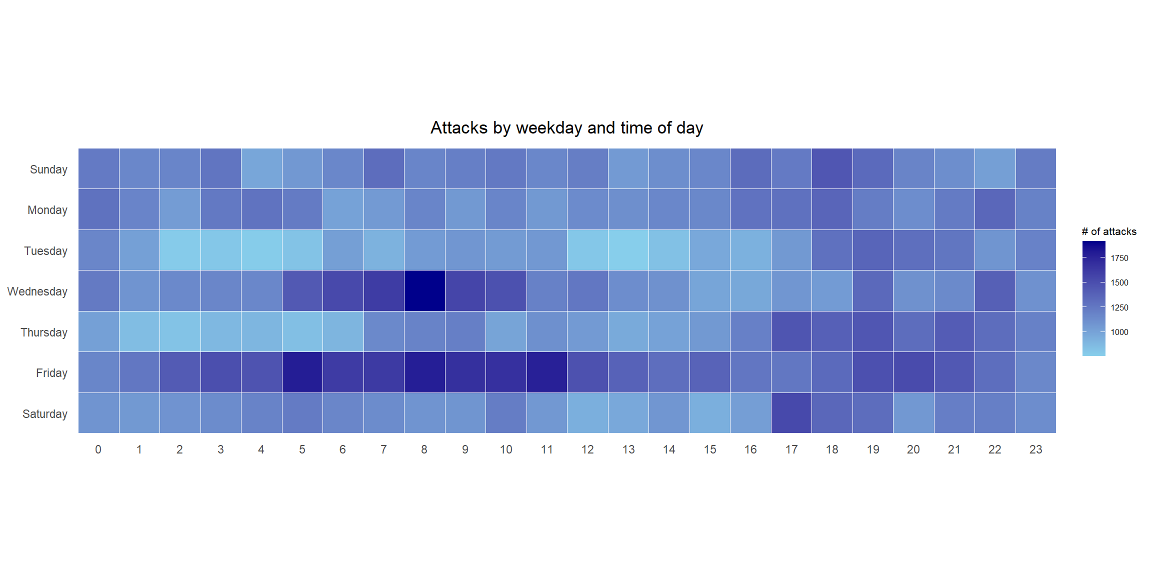
Things to learn from the code chunk
a tibble data table called grouped is derived by aggregating the attack by wkday and hour fields.
a new field called n is derived by using
group_by()andcount()functions.na.omit()is used to exclude missing value.geom_tile()is used to plot tiles (grids) at each x and y position.colorandsizearguments are used to specify the border color and line size of the tiles.theme_tufte()of ggthemes package is used to remove unnecessary chart junk.coord_equal()is used to ensure the plot will have an aspect ratio of 1:1.scale_fill_gradient()function is used to creates a two colour gradient (low-high).
6.3.1 Multiple Calendar Heatmaps
Step 1: Deriving attack by country object
In order to identify the top 4 countries with the highest number of attacks, we will need to do the following:
count the number of attacks by country,
calculate the percent of attacks by country, and
save the results in a tibble data frame.
attacks_by_country <- count(
  attacks, source_country) %>%
  mutate(percent = percent(n/sum(n))) %>%
  arrange(desc(n))
Step 2: Preparing the tidy data frame
In this step, we will extract the attack records of the top 4 countries from attacks data frame and save the data in a new tibble data frame (i.e. top4_attacks).
top4 <- attacks_by_country$source_country[1:4]
top4_attacks <- attacks %>%
  filter(source_country %in% top4) %>%
  count(source_country, wkday, hour) %>%
  ungroup() %>%
  mutate(source_country = factor(
    source_country, levels = top4)) %>%
  na.omit()
Step 3: Plotting the Multiple Calender Heatmap by using ggplot2 package.
ggplot(top4_attacks,
       aes(hour,
           wkday,
           fill = n)) +
  geom_tile(color = "white",
          size = 0.1) +
  theme_tufte(base_family = "Helvetica") +
  coord_equal() +
  scale_fill_gradient(name = "# of attacks",
                    low = "sky blue",
                    high = "dark blue") +
  facet_wrap(~source_country, ncol = 2) +
  labs(x = NULL, y = NULL,
     title = "Attacks on top 4 countries by weekday and time of day") +
  theme(axis.ticks = element_blank(),
        axis.text.x = element_text(size = 7),
        plot.title = element_text(hjust = 0.5),
        legend.title = element_text(size = 8),
        legend.text = element_text(size = 6) )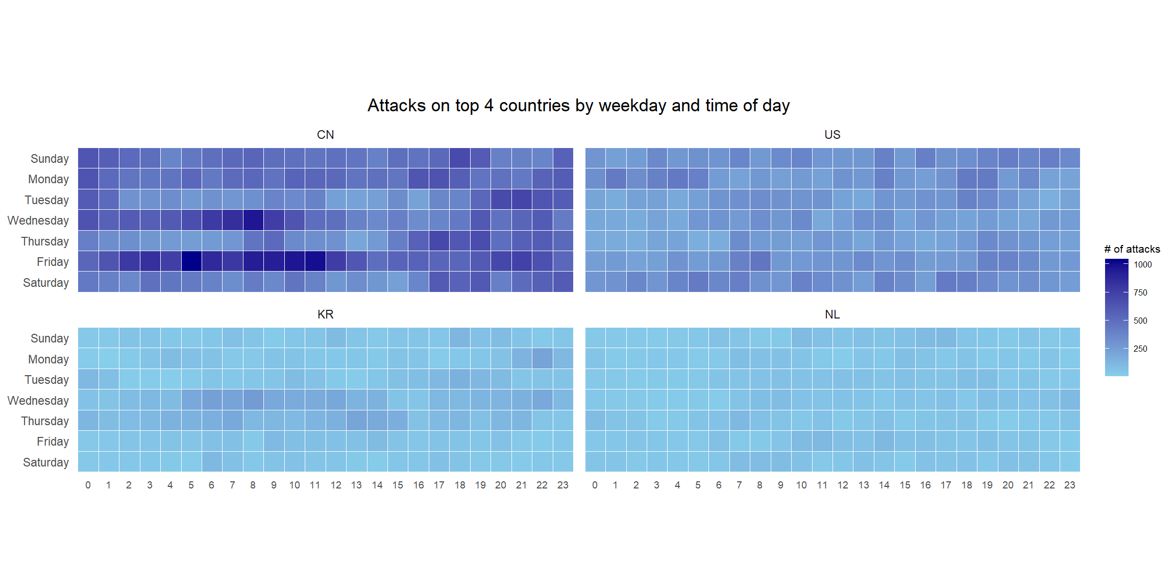
6.4 Plotting Cycle Plot
In this section, we will learn how to plot a cycle plot showing the time-series patterns and trend of visitor arrivals from Vietnam programmatically by using ggplot2 functions.
6.4.1 Importing Data
For the purpose of this exercise, arrivals_by_air.xlsx will be used.
The code below imports arrivals_by_air.xlsx by using read_excel() of readxl package and save it as a tibble data frame called air.
air <- read_excel("data/arrivals_by_air.xlsx")6.4.2 Deriving month and year fields
Two new fields called month and year are derived from Month-Year field.
air$month <- factor(month(air$`Month-Year`),
                    levels=1:12,
                    labels=month.abb,
                    ordered=TRUE)
air$year <- year(ymd(air$`Month-Year`))
6.4.3 Extracting the target country
The code below is used to extract data for the target country (i.e. Vietnam).
Vietnam <- air %>%
  select(`Vietnam`,
         month,
         year) %>%
  filter(year >= 2010)
6.4.4 Computing year average arrivals by month
The code below uses group_by() and summarise() of dplyr to compute year average arrivals by month.
hline.data <- Vietnam %>%
  group_by(month) %>%
  summarise(avgvalue = mean(`Vietnam`))
6.4.5 Plotting the cycle plot
The code below is used to plot the cycle plot.
ggplot() +
  geom_line(data=Vietnam,
            aes(x=year,
                y=`Vietnam`,
                group=month),
            colour="black") +
  geom_hline(aes(yintercept=avgvalue),
             data=hline.data,
             linetype=6,
             colour="red",
             size=0.5) +
  facet_grid(~month) +
  labs(axis.text.x = element_blank(),
       title = "Visitor arrivals from Vietnam by air, Jan 2010-Dec 2019") +
  xlab("") +
  ylab("No. of Visitors") +
  theme_tufte(base_family = "Helvetica")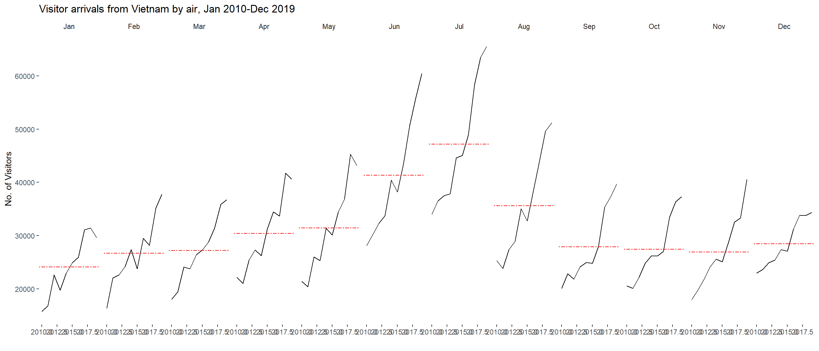
6.5 Plotting Slopegraph
In this section we will learn how to plot a slopegraph by using R.
Before getting start, make sure that CGPfunctions has been installed and loaded onto R environment.
To learn more about the function, we can refer to Using newggslopegraph .
newggslopegraph() and its arguments can be referenced at this link.
6.5.1 Importing Data
We will use the code below to import the rice data set into R environment.
rice <- read_csv("data/rice.csv")6.5.2 Plotting the Slopegraph
The code below will be used to plot a basic slopegraph.
rice %>%
  mutate(Year = factor(Year)) %>%
  filter(Year %in% c(1961, 1980)) %>%
  newggslopegraph(Year, Yield, Country,
                Title = "Rice Yield of Top 11 Asian Counties",
                SubTitle = "1961-1980",
                Caption = NULL)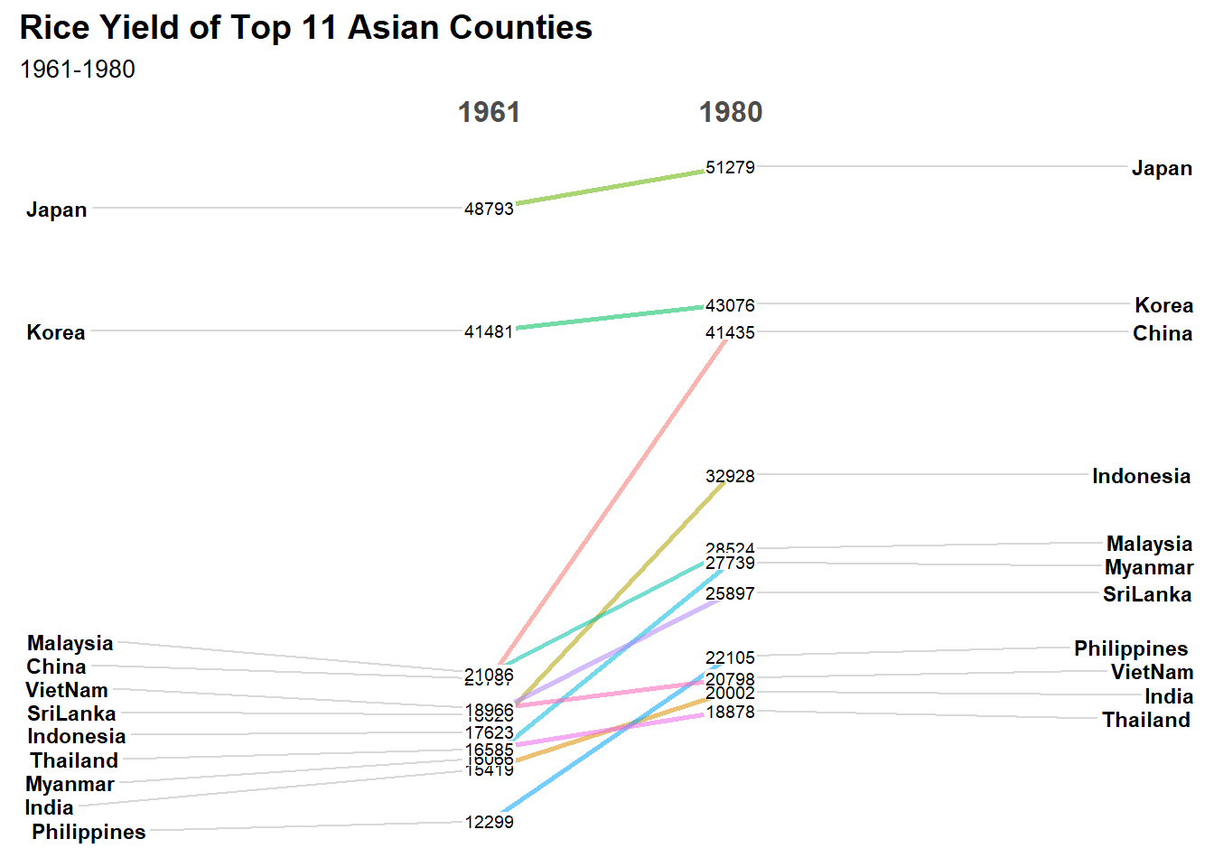
Note
For effective data visualisation design, factor() is used convert the value type of Year field from numeric to factor.
6.6 Plotting Practise
Below are additional plots for practise.
Show the code
combined_data <- read_csv("data/combined_data.csv")Show the code
rain_fall_summary <- combined_data %>%
  group_by(Year, Month) %>%
  summarize(
    MeanRainfall = mean(Daily_Rainfall_Total_mm, na.rm = TRUE),
    RainyDays = sum(Daily_Rainfall_Total_mm > 0, na.rm = TRUE), # Count days with rain
    .groups = 'drop'
  )
rain_fall_summary %>%
mutate(Year = factor(Year)) %>%
filter(Year %in% c(1983, 1993, 2003, 2013, 2023)) %>%
newggslopegraph(Year, RainyDays, Month,
Title = "The number of rain days have increased in December,and decreased in July",
SubTitle = "1983-2023",
Caption = "Changi Climate station") +
theme_tufte() +
theme(legend.position = "none")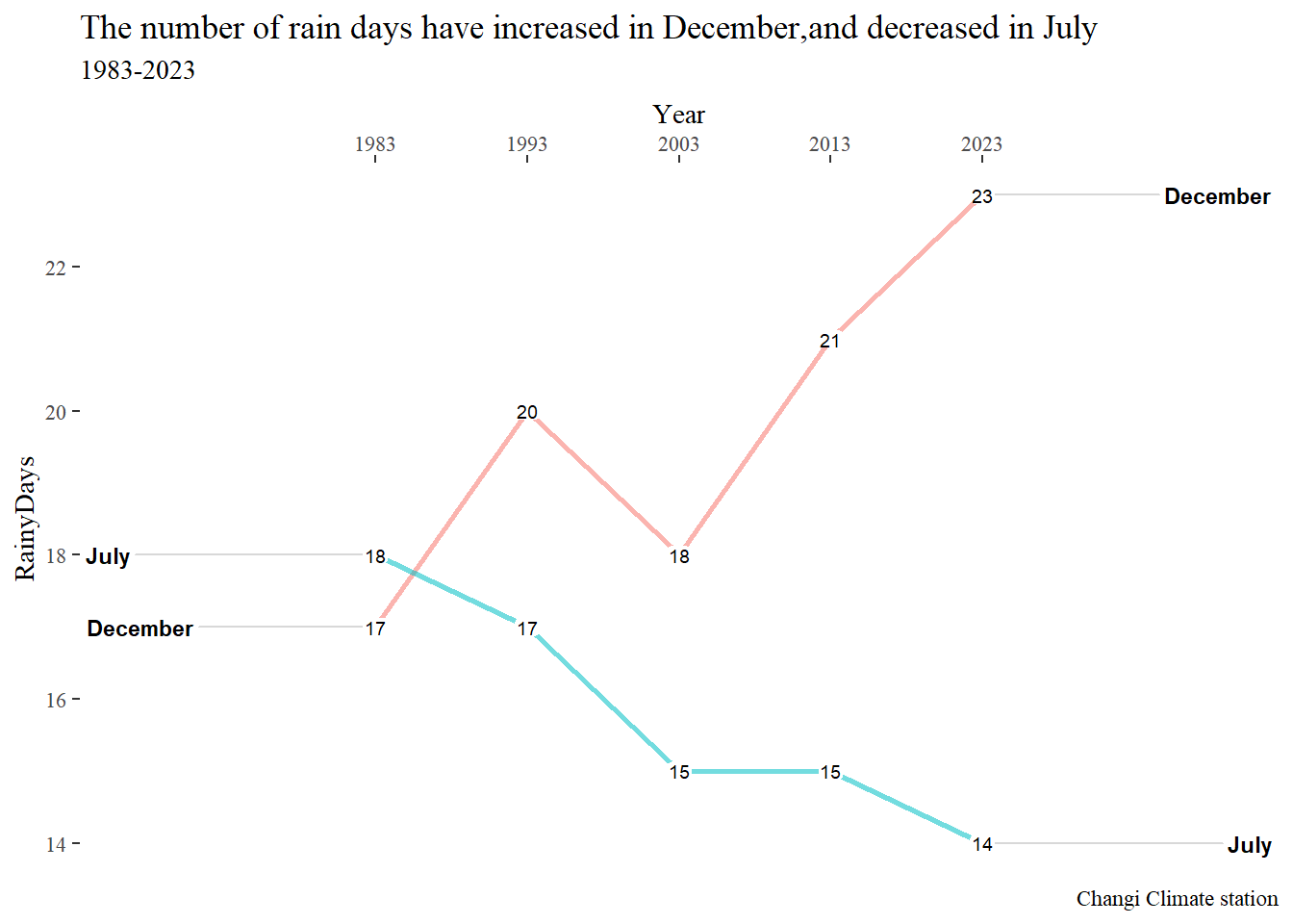
rain_fall_summary %>%
  mutate(Year = factor(Year)) %>%
  filter(Year %in% c(1983, 1993, 2003, 2013, 2023)) %>%
  mutate(Mean_Rainfall = round(MeanRainfall, 2)) %>%
  newggslopegraph(Year, Mean_Rainfall, Month,
                  Title = "Average Rainfall has trended lower over the years (1983-2023)",
                  SubTitle = NULL,
                  Caption = "Changi Climate Station") +
                  theme_tufte() +
                  theme(legend.position = "none")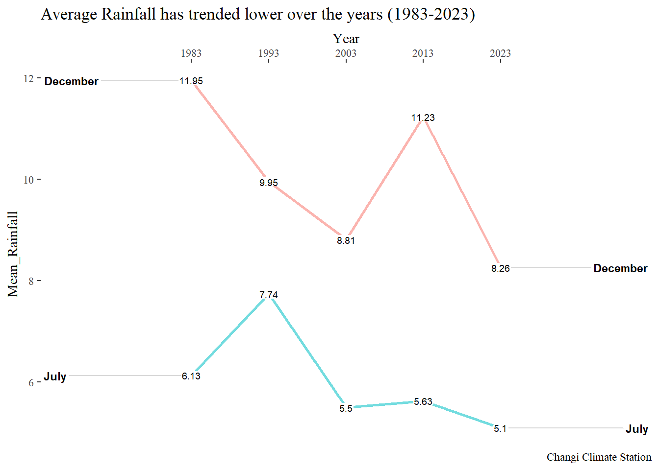
6.7 References
Main reference: Kam, T.S. (2024). Visualising and Analysing Time-oriented Data