pacman::p_load(tidyverse, haven)Take-Home Exercise 1
Creating data visualisation beyond default
Setting the Scene
OECD education director Andreas Schleicher shared in a BBC article that “Singapore managed to achieve excellence without wide differences between children from wealthy and disadvantaged families.” (2016) Furthermore, several of Singapore’s ministers for Education also started an “every school a good school” slogan. The general public, however, believes that there are still disparities that exist, especially between “elite” and neighborhood schools, between students from families with higher socioeconomic status and those with relatively lower socioeconomic status and immigration and non-immigration families.
The Task
The 2022 Programme for International Student Assessment (PISA) data was released on December 5, 2022. PISA’s global education survey runs every three years to assess education systems worldwide through the testing 15 year old students in the subjects of mathematics, reading, and science.
In this take-home exercise, we will use appropriate Exploratory Data Analysis (EDA) methods and ggplot2 functions to reveal:
the distribution of Singapore students’ performance in mathematics, reading, and science, and
the relationship between these performances with schools, gender and socioeconomic status of the students.
The Data
The PISA 2022 database contains the full set of responses from individual students, school principals and parents. There are a total of five data files and their contents are as follows:
Student questionnaire data file
School questionnaire data file
Teacher questionnaire data file
Cognitive item data file
Questionnaire timing data file
These data files are in SAS and SPSS formats. For the purpose of this assignment, we will use the Student questionnaire data file only.
To learn more about PISA 2022 survey, please refer to the PISA 2022 Technical Report
1. Getting Started
1.1 Loading R packages
1.2 Importing PISA data
The code chunk below uses ‘read_sas()’ of haven to import PISA data into the R environment.
stu_qqq <- read_sas("data/cy08msp_stu_qqq.sas7bdat")Upon first import, as the student questionaire data file contains data from other countries, we will use filter() to filter the data file to only Singapore data.
stu_qqq_SG <- stu_qqq %>%
  filter(CNT == "SGP")
We use write_rds() to save the filtered datafile to a seperate file called stu_qqq_SG
write_rds(stu_qqq_SG,
          "data/stu_qqq_SG.rds")
For our analysis we shall read in data from stu_qqq_SG.rds using read_rds()
stu_qqq_SG <- read_rds("data/stu_qqq_SG.rds")1.3 Installing and Loading R instvy
The R package intsvy allows R users to analyse PISA data among other international large-scale assessments. The use of PISA data via R requires data preparation, and intsvy offers a data transfer function to import data available in other formats directly into R. Intsvy also provides a merge function to merge the student, school, parent, teacher and cognitive databases.
To understand more about the packages available and the methodology to analyse the PISA data files, please refer to this link.
The analytical commands within intsvy enables users to derive mean statistics, standard deviations, frequency tables, correlation coefficients and regression estimates.
Additionally, intsvy deals with the calculation of point estimates and standard errors that take into account the complex PISA sample design with replicate weights, as well as the rotated test forms with plausible values.
To understand more about the instvy package, please refer to this link.
install.packages("intsvy",repos = "http://cran.us.r-project.org")We will load the package using library()
library("intsvy")1.2 Data preparation
Checking the data set structure.
head(stu_qqq_SG)# A tibble: 6 × 1,279
CNT CNTRYID CNTSCHID CNTSTUID CYC NatCen STRATUM SUBNATIO REGION OECD
<chr> <dbl> <dbl> <dbl> <chr> <chr> <chr> <chr> <dbl> <dbl>
1 SGP 702 70200052 70200001 08MS 070200 SGP01 7020000 70200 0
2 SGP 702 70200134 70200002 08MS 070200 SGP01 7020000 70200 0
3 SGP 702 70200112 70200003 08MS 070200 SGP01 7020000 70200 0
4 SGP 702 70200004 70200004 08MS 070200 SGP01 7020000 70200 0
5 SGP 702 70200152 70200005 08MS 070200 SGP01 7020000 70200 0
6 SGP 702 70200043 70200006 08MS 070200 SGP01 7020000 70200 0
# ℹ 1,269 more variables: ADMINMODE <dbl>, LANGTEST_QQQ <dbl>,
# LANGTEST_COG <dbl>, LANGTEST_PAQ <dbl>, Option_CT <dbl>, Option_FL <dbl>,
# Option_ICTQ <dbl>, Option_WBQ <dbl>, Option_PQ <dbl>, Option_TQ <dbl>,
# Option_UH <dbl>, BOOKID <dbl>, ST001D01T <dbl>, ST003D02T <dbl>,
# ST003D03T <dbl>, ST004D01T <dbl>, ST250Q01JA <dbl>, ST250Q02JA <dbl>,
# ST250Q03JA <dbl>, ST250Q04JA <dbl>, ST250Q05JA <dbl>, ST250D06JA <chr>,
# ST250D07JA <chr>, ST251Q01JA <dbl>, ST251Q02JA <dbl>, ST251Q03JA <dbl>, …There are a total of 6,606 rows and 1,279 columns in this data file.
data_dimensions <- dim(stu_qqq_SG)

#Display the number of rows and columns
data_dimensions
[1] 6606 1279Checking for Na values. There are a large number of NA values in the data file.
sum(is.na(stu_qqq_SG))[1] 4168500Checking for duplicated rows using duplicated(). There are no duplicated rows in the data file.
stu_qqq_SG[duplicated(stu_qqq_SG),]# A tibble: 0 × 1,279
# ℹ 1,279 variables: CNT <chr>, CNTRYID <dbl>, CNTSCHID <dbl>, CNTSTUID <dbl>,
# CYC <chr>, NatCen <chr>, STRATUM <chr>, SUBNATIO <chr>, REGION <dbl>,
# OECD <dbl>, ADMINMODE <dbl>, LANGTEST_QQQ <dbl>, LANGTEST_COG <dbl>,
# LANGTEST_PAQ <dbl>, Option_CT <dbl>, Option_FL <dbl>, Option_ICTQ <dbl>,
# Option_WBQ <dbl>, Option_PQ <dbl>, Option_TQ <dbl>, Option_UH <dbl>,
# BOOKID <dbl>, ST001D01T <dbl>, ST003D02T <dbl>, ST003D03T <dbl>,
# ST004D01T <dbl>, ST250Q01JA <dbl>, ST250Q02JA <dbl>, ST250Q03JA <dbl>, …We next examine some columns for NA values. For example “PV1MATH” and “ESCS”.
sum(is.na(stu_qqq_SG$PV1MATH))[1] 0sum(is.na(stu_qqq_SG$ESCS))[1] 47
Note
From our initial checks, we noted that there are several variables with missing values.
Rather than checking and deleting all missing values, we will continue to maintain the original data file.
This will enable us to use several functions in the instvy package to compute and derive statistics from variables like Plausible Values. Subsequently we will prepare subsets from the data file for each EDA visualization.
Important
The columns in the PISA data set are named in a specific format. For more information on what each Variable means and how it is derived or calculated, please refer to the questionnaire or code book at this link.
Variable values are both continuous and discrete.
1.2.1 Working with Plausible Values
PISA reports student performance through plausible values (PVs), obtained from Item Response Theory models (for details, see Chapter 5 of the PISA Data Analysis Manual: SAS or SPSS, Second Edition or the associated guide “Scaling of Cognitive Data and Use of Students Performance Estimates”).
An accurate and efficient way of measuring proficiency estimates in PISA requires five steps:
Compute estimates for each Plausible Values (PV)
Compute final estimate by averaging all estimates obtained from (1)
Compute sampling variance (unbiased estimate are providing by using only one PV)
Compute imputation variance (measurement error variance, estimated for each PV and then average over the set of PVs)
Compute final standard error by combining (3) and (4)
For more information, please refer to this link.
For example, in order to obtain single mean scores in Math, Reading and Science for the student cohort, we can use the pisa.mean.pv() function from 'instvy' package like below.
Math_mean_SG <- pisa.mean.pv(pvlabel = paste0("PV",1:10,"MATH"), by="CNT", data=stu_qqq_SG)

Read_mean_SG <- pisa.mean.pv(pvlabel = paste0("PV",1:10,"READ"), by="CNT", data=stu_qqq_SG)

SCIE_mean_SG <- pisa.mean.pv(pvlabel = paste0("PV",1:10,"SCIE"), by="CNT", data=stu_qqq_SG)
Below is an example of a single mean score for Math for the student cohort.
print(Math_mean_SG) CNT Freq Mean s.e. SD s.e
1 SGP 6606 574.66 1.23 102.8 0.91print(Read_mean_SG) CNT Freq Mean s.e. SD s.e
1 SGP 6606 542.55 1.87 105.89 1.15print(SCIE_mean_SG) CNT Freq Mean s.e. SD s.e
1 SGP 6606 561.43 1.33 99.09 1.1These mean scores values can be corroborated at the following link (pages 310-315).
For a visual of the past performance of the mean scores for Singaporean students, please refer to this link.
We will use these calculated mean values from the 10 plausible values as a statistic (Mean) for some of our visualizations.
1.3 Exploratory Data Analysis
1.3.1 Distribution of student’s performance in Math, Reading and Science
The objective of this visualization is to examine if subject scores are normally distributed in general within the student population sampled in the PISA test.
Since there are 10 Plausible Values for the 3 subjects, we shall use the first plausible value, PV1 to visualize the distribution of scores for the subjects.
For an example of precedence of using only one Plausible Value, please refer to the article on “How to deal with Plausible Values from International Large-scale assessments.”
We will use the below code to plot our histograms to show the distribution of scores across subjects.
Show the code
# Create the histogram plot with an annotated mean line using Math_mean_SG
plt1 <- ggplot(stu_qqq_SG, aes(x = PV1MATH)) +
  geom_histogram(binwidth = 20, color = "white", fill='lightblue') +
  labs(x = "PV1 Math Score",
       y = "Frequency") +
  geom_vline(xintercept = Math_mean_SG$Mean,
             col = 'black',
             size = 0.5,
             linetype = "dashed") +
  geom_text(aes(x = Math_mean_SG$Mean, y = 100, label = paste("Mean =", round(Math_mean_SG$Mean, 2))),
            color = "black", hjust = -0.1, vjust = 1.0) +  # Adjust label position
  theme_minimal()

# Create the histogram plot with an annotated mean line using Read_mean_SG
plt2 <- ggplot(stu_qqq_SG, aes(x = PV1READ)) +
  geom_histogram(binwidth = 20, color = "white", fill='lightgreen') +
  labs(x = "PV1 Reading Score",
       y = "Frequency") +
  geom_vline(xintercept = Read_mean_SG$Mean,
             col = 'black',
             size = 0.5,
             linetype = "dashed") +
  geom_text(aes(x = Read_mean_SG$Mean, y = 100, label = paste("Mean =", round(Read_mean_SG$Mean, 2))),
            color = "black", hjust = -0.1, vjust = 1.0) +  # Adjust label position
  theme_minimal()


# Create the histogram plot with an annotated mean line using Science_mean_SG
plt3 <- ggplot(stu_qqq_SG, aes(x = PV1SCIE)) +
  geom_histogram(binwidth = 20, color = "white", fill='lightpink') +
  labs(x = "PV1 Science Score",
       y = "Frequency") +
  geom_vline(xintercept = SCIE_mean_SG$Mean,
             col = 'black',
             size = 0.5,
             linetype = "dashed") +
  geom_text(aes(x = SCIE_mean_SG$Mean, y = 100, label = paste("Mean =", round(SCIE_mean_SG$Mean, 2))),
            color = "black", hjust = -0.1, vjust = 1.0) +  # Adjust label position
  theme_minimal()

# Create a single plot with density plots for Math, Reading, and Science scores
plt4 <- ggplot(stu_qqq_SG, aes(x = PV1MATH, fill = "Math")) +
  geom_density(alpha = 0.5) +
  geom_density(data = stu_qqq_SG, aes(x = PV1READ, fill = "Reading"), alpha = 0.5) +
  geom_density(data = stu_qqq_SG, aes(x = PV1SCIE, fill = "Science"), alpha = 0.5) +
  labs(x = "Scores",
       y = "Density") +
  scale_fill_manual(values = c("Math" = "lightblue", "Reading" = "lightgreen", "Science" = "lightpink")) +
  guides(fill = FALSE) +  # Remove the legend
  theme_minimal()
Combined Visual of the distribution of scores in general
We will use patchwork to create a composite plot.
Show the code
library(patchwork)

patch1 <- (plt1+plt2) / (plt3+plt4)  +
              plot_annotation(
                title = "Distribution of student performance in Math, Reading and Science")

patch1 & theme( axis.text.y = element_blank(),panel.grid.major = element_blank(),)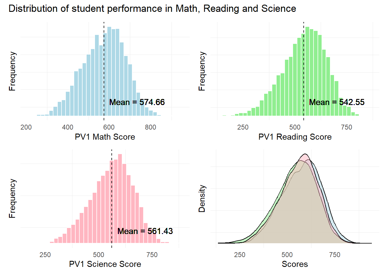
Observation 1
The distribution of scores seem to resemble a normal distribution across all 3 subjects. Singaporean students seem to have a higher mean score In Mathematics relative to Reading and Science.
Further statistical tests like the Anderson-Darling or Shapiro-Wilk tests will need to be conducted to confirm the normality in distribution.
1.3.2 Relationship between Scores and Schools
The objective of this visualization is to examine the relationship between subject scores and the schools sampled in the PISA test.
We will use unique() and length() to obtain the number of unique schools in the data set.
unique_values <- unique(stu_qqq_SG$CNTSCHID)

length(unique_values)
[1] 164There are 164 unique schools in this data set.
Next, we use the code below to plot our scatter plots.
Show the code
p1 <- ggplot(stu_qqq_SG, aes(x = CNTSCHID, y = PV1MATH)) +
  geom_point(color = "lightblue", alpha = 0.5) +
  geom_hline(yintercept = Math_mean_SG$Mean, color = "black", linetype = "dashed") +
  annotate("text", x = Inf, y = Math_mean_SG$Mean, label = paste("Mean =", round(Math_mean_SG$Mean, 2)),
           hjust = 1, vjust = -1) +
  labs(x = "School ID",
       y = "PV1 Math Score") +
  theme_minimal()

p2 <- ggplot(stu_qqq_SG, aes(x = CNTSCHID, y = PV1READ)) +
  geom_point(color = "lightgreen", alpha = 0.5) +
  geom_hline(yintercept = Read_mean_SG$Mean, color = "black", linetype = "dashed") +
  annotate("text", x = Inf, y = Read_mean_SG$Mean, label = paste("Mean =", round(Read_mean_SG$Mean, 2)),
           hjust = 1, vjust = -1) +
  labs(x = "School ID",
       y = "PV1 Reading Score") +
  theme_minimal()

p3 <- ggplot(stu_qqq_SG, aes(x = CNTSCHID, y = PV1SCIE)) +
  geom_point(color = "lightpink", alpha = 0.5) +
  geom_hline(yintercept = SCIE_mean_SG$Mean, color = "black", linetype = "dashed") +
  annotate("text", x = Inf, y = SCIE_mean_SG$Mean, label = paste("Mean =", round(SCIE_mean_SG$Mean, 2)),
           hjust = 1, vjust = -1) +
  labs(x = "School ID",
       y = "PV1 Science Score") +
  theme_minimal()
Combined Visual of the distribution of scores across Schools
We will use patchwork to create a composite plot.
Show the code
patch2 <- p1/p2/p3 +
              plot_annotation(
                title = "Students seem to be performing equally across Schools")

patch2 & theme( axis.text.y = element_blank(),panel.grid.major = element_blank(),)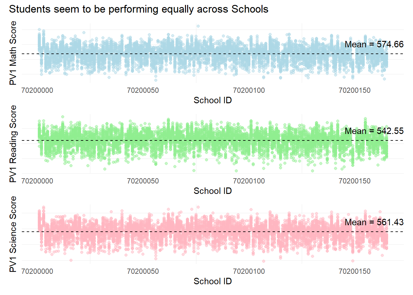
Observation 2
Across the 164 schools, students seem to be performing equally across the 3 subjects. There are no significant clusters that are different from each other, for example, a large number of schools which only have good scores or only poor scores.
Additional analysis could be done to examine if the highest and lowest performing students (in terms of scores) belong to the same type of schools.
Since this data set only contains students on students, there is no additional information on either the type of school or its resources.. Further analysis could incorporate other data sets to build a more complete analysis.
1.3.3 Relationship between Scores and Gender
The objective of this visualization is to examine the relationship between subject scores and gender within the students sampled in the PISA test.
The gender column of the data set is named as “ST004D01T” with values of 1=Female and 2=Male.
The pisa.mean.pv() function from the instvy package enables us to calculate the mean scores from the 10 Plausible Values and enables us to further group by gender.
In the code below, we will create separate tables for the mean scores for each subject by different genders.
Show the code
Math_gender <- pisa.mean.pv(pvlabel = paste0("PV",1:10,"MATH"), by = "ST004D01T", data = stu_qqq_SG)

Math_gender$ST004D01T <- factor(Math_gender$ST004D01T, levels = c(1, 2), labels = c("Female", "Male"))

Read_gender <- pisa.mean.pv(pvlabel = paste0("PV",1:10,"READ"), by = "ST004D01T", data = stu_qqq_SG)

Read_gender$ST004D01T <- factor(Read_gender$ST004D01T, levels = c(1, 2), labels = c("Female", "Male"))

SCIE_gender <- pisa.mean.pv(pvlabel = paste0("PV",1:10,"SCIE"), by = "ST004D01T", data = stu_qqq_SG)

SCIE_gender$ST004D01T <- factor(SCIE_gender$ST004D01T, levels = c(1, 2), labels = c("Female", "Male"))
Below is how the new tables look like for mean Math score grouped by gender. We can use the mean statistic here as an additional statistic for our box plots.
print(Math_gender) ST004D01T Freq Mean s.e. SD s.e
1 Female 3248 568.49 1.65 97.62 1.14
2 Male 3358 580.59 1.75 107.20 1.33Next, we plot the PV1 scores by different genders to examine the performance of different genders across subjects.
Show the code
# Create a subset of the data with gender and PV1 score columns
subset_gender_PV1 <- stu_qqq_SG %>%
  select(ST004D01T, PV1MATH, PV1SCIE, PV1READ)

# Convert the "ST004D01T" column to a factor
subset_gender_PV1$ST004D01T <- factor(subset_gender_PV1$ST004D01T, levels = c(1, 2), labels = c("Female", "Male"))

# Create the plot using the subset_data
bxp1 <- ggplot(subset_gender_PV1, aes(x = ST004D01T, y = PV1MATH, fill = ST004D01T)) +
  geom_boxplot() +
  geom_point(data = Math_gender, aes(x = ST004D01T, y = Mean), color = "blue", size = 1.5) +
  geom_text(data = Math_gender, aes(x = ST004D01T, y = Mean, label = round(Mean, 2)),
            color = "black", vjust = -0.5, size = 3.5) +
  labs(x = "Gender",
       y = "PV1 Math Score") +
  scale_fill_manual(values = c("Female" = "lightblue", "Male" = "lightblue")) +
  theme_minimal() +
  theme(legend.position = "none")  # Remove the legend


bxp2 <- ggplot(subset_gender_PV1, aes(x = ST004D01T, y = PV1READ, fill = ST004D01T)) +
  geom_boxplot() +
  geom_point(data = Read_gender, aes(x = ST004D01T, y = Mean), color = "blue", size = 1.5) +
  geom_text(data = Read_gender, aes(x = ST004D01T, y = Mean, label = round(Mean, 2)),
            color = "black", vjust = -0.5, size = 3.5) +
  labs(x = "Gender",
       y = "PV1 Reading Score") +
  scale_fill_manual(values = c("lightgreen", "lightgreen")) +  # Associate colors with factor levels
  theme_minimal() +
  theme(legend.position = "none")  # Remove the legend

bxp3 <- ggplot(subset_gender_PV1, aes(x = ST004D01T, y = PV1SCIE, fill = ST004D01T)) +
  geom_boxplot() +
  geom_point(data = SCIE_gender, aes(x = ST004D01T, y = Mean), color = "blue", size = 1.5) +
  geom_text(data = SCIE_gender, aes(x = ST004D01T, y = Mean, label = round(Mean, 2)),
            color = "black", vjust = -0.5, size = 3.5) +
  labs(x = "Gender",
       y = "PV1 Science Score") +
  scale_fill_manual(values = c("lightpink", "lightpink")) +  # Associate colors with factor levels
  theme_minimal() +
  theme(legend.position = "none")  # Remove the legend
Combined Visual of Performance across Genders
We will use the code below to create a composite plot for our box plots.
Show the code
patch3 <- bxp1 + bxp2 + bxp3 +
              plot_annotation(
                title = "Male students outperform in Maths and Science")

patch3 & theme( axis.text.y = element_blank(),panel.grid.major = element_blank(),)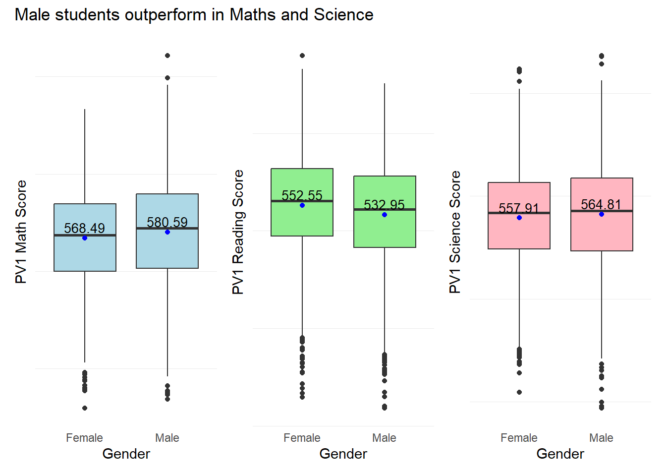
Observation 3
Male students seem to outperform Female students in both Maths and Science with mean scores of 580.59 and 564.81 respectively. Female students seem to outperform Male students in Reading with a mean score of 552.55.
1.3.4 Relationship between Scores and Socioeconomic status of students
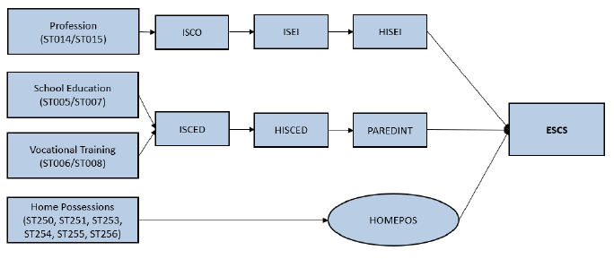
The socioeconomic status of students is represented by the “ESCS” score in the PISA data set. The ESCS score is a continuous variable and is calculated from three indicators: highest parental occupation status (HISEI), highest education of parents in years (PAREDINT), and home possessions (HOMEPOS). A higher ESCS score translates to a “better-off” student.
Further break down on the 3 main components of the ESCS score is shown in the diagram below. For further information on the computation methodology, please refer to the PISA 2022 Technical report: Chapter 19.
The objective of this visualization is to examine the relationship between subject scores and a student’s socioeconomic status.
First we check for any missing values in the ESCS column using the code below.
# Check for NAs in the 'ESCS' column
has_nas <- any(is.na(stu_qqq_SG$ESCS))

print(has_nas)
[1] TRUESince there are missing values in the ESCS column, we shall delete the rows with missing ESCS values. We will create a new subset with ESCS and the PV1 scores for this visualization.
subset_ESCS_PV1 <- stu_qqq_SG %>%
  select(ESCS, PV1MATH, PV1SCIE, PV1READ)

#omiting NA values
subset_ESCS_PV1 <- na.omit(subset_ESCS_PV1)
Using our new table subset_ESCS_PV1, we will create scatter plots for ESCS versus each PV1 score for each subject using the code below.
Show the code
c_coeff_ESCS_Math <- cor(subset_ESCS_PV1$ESCS, subset_ESCS_PV1$PV1MATH)

C_plt1 <- ggplot(subset_ESCS_PV1, aes(x = ESCS, y = PV1MATH)) +
  geom_point(color = "lightblue") +
  geom_smooth(method = "lm", formula = y ~ x, color = "black") +
  geom_text(
    x = max(subset_ESCS_PV1$ESCS),
    y = max(subset_ESCS_PV1$PV1MATH),
    label = paste("Corr Coeff:", round(c_coeff_ESCS_Math, 2)),
    hjust = 1,  # Adjust horizontal justification
    vjust = 1   # Adjust vertical justification
  ) +
  labs(x = "Socio-Economic Status (ESCS)",
       y = "PV1 Math Score") +
  theme_minimal()

c_coeff_ESCS_Read <- cor(subset_ESCS_PV1$ESCS, subset_ESCS_PV1$PV1READ)

C_plt2 <- ggplot(subset_ESCS_PV1, aes(x = ESCS, y = PV1READ)) +
  geom_point(color = "lightgreen") +
  geom_smooth(method = "lm", formula = y ~ x, color = "black") +
  geom_text(
    x = max(subset_ESCS_PV1$ESCS),
    y = max(subset_ESCS_PV1$PV1READ),
    label = paste("Corr Coeff:", round(c_coeff_ESCS_Read, 2)),
    hjust = 1,  # Adjust horizontal justification
    vjust = 1   # Adjust vertical justification
  ) +
  labs(x = "Socio-Economic Status (ESCS)",
       y = "PV1 Read Score") +
  theme_minimal()

c_coeff_ESCS_Scie <- cor(subset_ESCS_PV1$ESCS, subset_ESCS_PV1$PV1SCIE)

C_plt3 <- ggplot(subset_ESCS_PV1, aes(x = ESCS, y = PV1SCIE)) +
  geom_point(color = "lightpink") +
  geom_smooth(method = "lm", formula = y ~ x, color = "black") +
  geom_text(
    x = max(subset_ESCS_PV1$ESCS),
    y = max(subset_ESCS_PV1$PV1SCIE),
    label = paste("Corr Coeff:", round(c_coeff_ESCS_Scie, 2)),
    hjust = 1,  # Adjust horizontal justification
    vjust = 1   # Adjust vertical justification
  ) +
  labs(x = "Socio-Economic Status (ESCS)",
       y = "PV1 Science Score") +
  theme_minimal()
Combined Scatter plots of PV1 Scores Vs ESCS scores
We will use patchwork to create a composite plot for our scatter plots.
Show the code
patch4 <- C_plt1 / C_plt2 / C_plt3 +
              plot_annotation(
                title = "Weak positive relationship between Scores and ESCS")

patch4 & theme( axis.text.y = element_blank(),panel.grid.major = element_blank(),)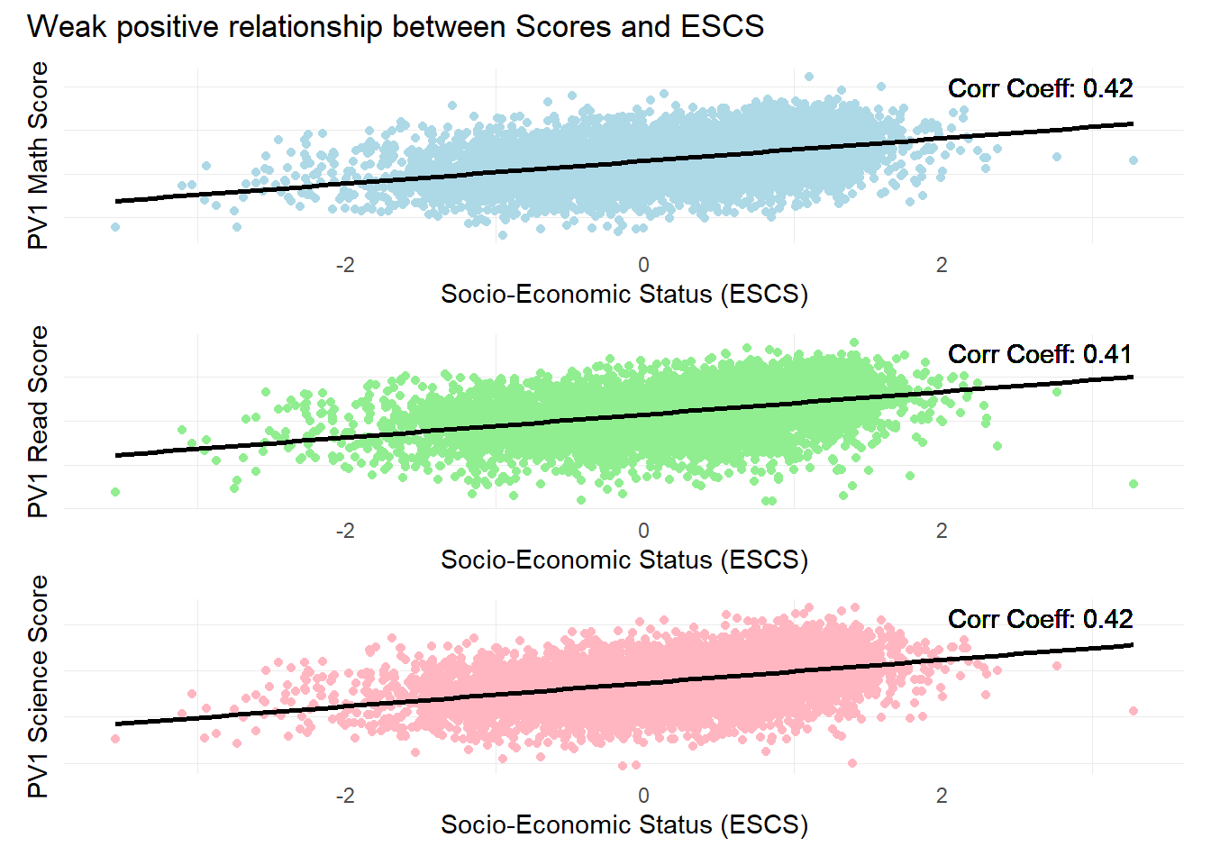
Observation 4
There is a weak positive relationship between subject scores and Socioeconomic statuses. The ESCS score is a composite score calculated from three indicators: highest parental occupation status (HISEI), highest education of parents in years (PAREDINT), and home possessions (HOMEPOS). It could be likely that the larger number of constituents has ‘diluted’ the score, where the effect is more prominent for developed countries like Singapore.
Further analysis could be conducted on the individual components of the ESCS score to check for their individual influence on student performance.
1.3.5 Relationship between Scores and the years of Education for Parents
As highlighted in the previous analysis, there is a weak positive relationship between student scores and ESCS scores. The objective of this visualization is to examine the relationship between one of the constituents, PAREDINT and student scores.
PAREDINT is the index of the highest education of parents in years, based on the median cumulative years of education completed. The variable values are discrete and ranges from a scale of 3 to 16 years. For more information on this variable, please refer to the PISA 2022 Technical report: Chapter 19.
First we check for any missing values in the ESCS column using the code below.
# Check for NAs in the 'PAREDINT' column
has_nas <- any(is.na(stu_qqq_SG$PAREDINT))

print(has_nas)
[1] TRUESince there are missing values in the PAREDINT column, we shall delete the rows with missing PAREDINT values. We will then create a new table with PAREDINT and the Mean scores of the 10 Plausible Values for this visualization.
The pisa.mean.pv() function from the instvy package enables us to calculate the mean scores from the 10 Plausible Values and enables us to further group by the years of Parents education (PARENDINT).
In the code below, we will create separate tables for the mean scores for each subject by different years of Education.
Show the code
Parents_edu_math <- pisa.mean.pv(pvlabel = paste0("PV",1:10,"MATH"), by = "PAREDINT", data = stu_qqq_SG)

Parents_edu_read <- pisa.mean.pv(pvlabel = paste0("PV",1:10,"READ"), by = "PAREDINT", data = stu_qqq_SG)

Parents_edu_scie <- pisa.mean.pv(pvlabel = paste0("PV",1:10,"SCIE"), by = "PAREDINT", data = stu_qqq_SG)
We examine the one of the new tables, Parents_edu_math.
print(Parents_edu_math) PAREDINT Freq Mean s.e. SD s.e
1 3 8 482.25 53.59 131.99 25.91
2 6 62 500.76 12.97 102.52 9.03
3 9 127 540.05 8.87 98.63 6.43
4 12 1470 530.62 3.14 100.32 1.75
5 14.5 1213 559.85 3.00 97.10 1.95
6 16 3669 600.47 1.68 97.13 1.37
7 <NA> 57 485.92 11.61 85.05 9.59Since there 57 rows with missing values, we will delete the rows with missing values.
Parents_edu_math <- na.omit(Parents_edu_math)
Parents_edu_read <- na.omit(Parents_edu_read)
Parents_edu_scie <- na.omit(Parents_edu_scie)
Next, we use the below code to plot dot plots for each subject.
Show the code
# Create a dot plot with annotations
Dp1 <- ggplot(Parents_edu_math, aes(x = as.factor(PAREDINT), y = Mean)) +
  geom_dotplot(binaxis = "y", stackdir = "center", fill = "black", alpha = 0.7) +
  geom_line(aes(group = 1), color = "lightblue", size = 1, alpha = 0.5) +
  geom_text(aes(label = Mean), vjust = -0.5, color = "black", size = 3) +  # Add text labels
  labs(title = "Math",
       x = "Education (Yrs)")+
  theme_minimal()


Dp2 <- ggplot(Parents_edu_read, aes(x = as.factor(PAREDINT), y = Mean)) +
  geom_dotplot(binaxis = "y", stackdir = "center", fill = "black", alpha = 0.7) +
  geom_line(aes(group = 1), color = "lightgreen", size = 1, alpha = 0.5) +
  geom_text(aes(label = Mean), vjust = -0.5, color = "black", size = 3) +  # Add text labels
  labs(title = "Reading",
       x = "Education (Yrs)")+
  theme_minimal()

Dp3 <- ggplot(Parents_edu_scie, aes(x = as.factor(PAREDINT), y = Mean)) +
  geom_dotplot(binaxis = "y", stackdir = "center", fill = "black", alpha = 0.7) +
  geom_line(aes(group = 1), color = "lightpink", size = 1, alpha = 0.5) +
  geom_text(aes(label = Mean), vjust = -0.5, color = "black", size = 3) +  # Add text labels
  labs(title = "Science",
       x = "Education (Yrs)")+
  theme_minimal()
Combined dot plots of Subject Mean Scores Vs Parents Education years
We will use the code below to create a composite plot.
Show the code
patch4 <- (Dp1 + Dp2 + Dp3
               ) +
              plot_annotation(
                title = "Parents with more education years seem to have children with higher scores")

patch4 & theme( axis.text.y = element_blank(),panel.grid.major = element_blank(),)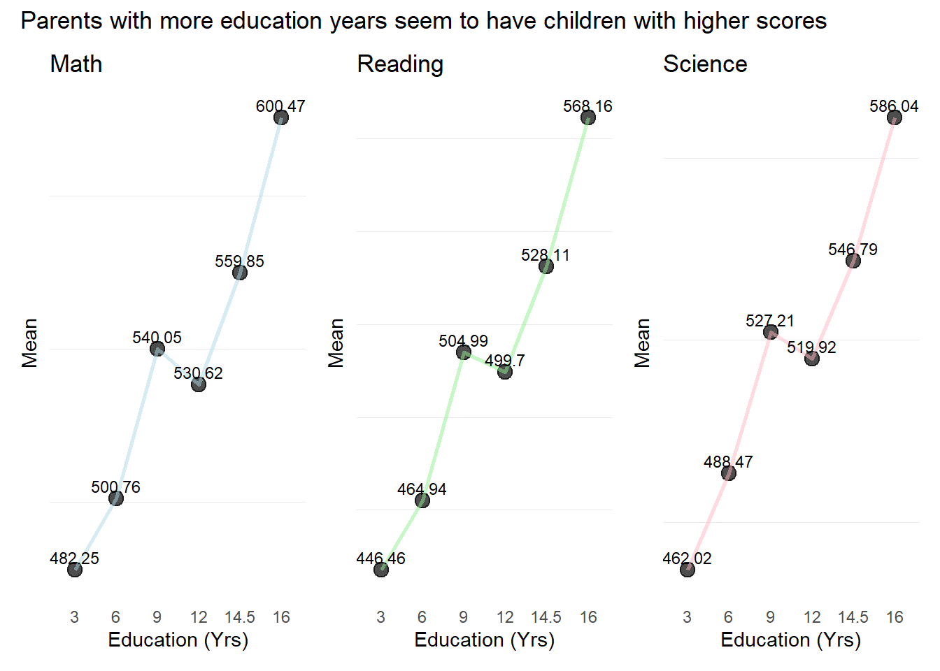
Observation 5
In general, students seem to have performed better across all subjects the more their parents have been educated. However this factor alone is likely insufficient to cause a better performance.
Also, there is a slight drop off in mean scores from 9-12 years of Parents Education
Additional analyses taking into account the state of the study environment, both at home and in school, as well as the emotional aspects and motivation of students could be further analysed to derive more complete insights on the factors that could influence performance.
1.3.6 Additional EDA
1) Examining closer into Mean scores per School
The pisa.mean.pv() function from the instvy package enables us to calculate the mean scores from the 10 Plausible Values and enables us to further group by the School ID (CNTSCHID).
In the code below, we will create separate tables for the mean scores for each subject by different School Ids.
Show the code
Schoolid_math <- pisa.mean.pv(pvlabel = paste0("PV",1:10,"MATH"), by = "CNTSCHID", data = stu_qqq_SG)

Schoolid_read <- pisa.mean.pv(pvlabel = paste0("PV",1:10,"READ"), by = "CNTSCHID", data = stu_qqq_SG)

Schoolid_scie <- pisa.mean.pv(pvlabel = paste0("PV",1:10,"SCIE"), by = "CNTSCHID", data = stu_qqq_SG)
We examine the new tables created. In these new tables we are able to extract the number of students and the mean scores per School.
head(Schoolid_math) CNTSCHID Freq Mean s.e. SD s.e
1 70200001 55 725.21 9.34 59.23 6.38
2 70200002 38 534.22 16.75 89.96 13.84
3 70200003 36 739.92 12.30 59.23 7.70
4 70200004 56 509.61 12.84 86.63 7.71
5 70200005 38 546.52 12.95 86.04 8.86
6 70200006 36 485.30 13.90 76.47 8.86Next, we use the below code to plot bubble plots to examine the number of students and their mean scores for each school. We will also use the plotly package for added interactivity.
#install.packages("plotly")Show the code
library(ggplot2)
library(plotly)

p_1 <- ggplot(Schoolid_math, aes(x = CNTSCHID, y = Mean)) +
  geom_point(aes(size = Freq, color = Freq), alpha = 0.5) +
  scale_size_area(max_size = 10) +
  scale_color_gradient(low = "skyblue", high = "darkblue") +
  labs(title = "Mean Math Scores by School ID",
    y = "Mean Math Scores",
    size = "Number of Students",
    color = "Number of Students") +
  theme_minimal() +
  theme(axis.text.x = element_blank(),
        axis.ticks.x = element_blank(),
        axis.title.x = element_blank(),
        panel.grid.major = element_blank(),  # Remove major grid lines
        panel.grid.minor = element_blank())  # Remove minor grid lines

# Convert to an interactive plot
ggplotly(p_1, tooltip = c("x", "y", "size", "color"))
Show the code
library(ggplot2)
library(plotly)

p_2 <- ggplot(Schoolid_read, aes(x = CNTSCHID, y = Mean)) +
  geom_point(aes(size = Freq, color = Freq), alpha = 0.5) +
  scale_size_area(max_size = 10) +
  scale_color_gradient(low = "yellow", high = "darkorchid") +
  labs(title = "Mean Reading Scores by School ID",
    y = "Mean Reading Scores",
    size = "Number of Students",
    color = "Number of Students") +
  theme_minimal() +
  theme(axis.text.x = element_blank(),
        axis.ticks.x = element_blank(),
        axis.title.x = element_blank(),
        panel.grid.major = element_blank(),  # Remove major grid lines
        panel.grid.minor = element_blank())  # Remove minor grid lines

# Convert to an interactive plot
ggplotly(p_2, tooltip = c("x", "y", "size", "color"))
Show the code
library(ggplot2)
library(plotly)

p_3 <- ggplot(Schoolid_scie, aes(x = CNTSCHID, y = Mean)) +
  geom_point(aes(size = Freq, color = Freq), alpha = 0.5) +
  scale_size_area(max_size = 10) +
  scale_color_gradient(low = "lightpink", high = "darkred") +
  labs(title = "Mean Science Scores by School ID",
    y = "Mean Science Scores",
    size = "Number of Students",
    color = "Number of Students") +
  theme_minimal() +
  theme(axis.text.x = element_blank(),
        axis.ticks.x = element_blank(),
        axis.title.x = element_blank(),
        panel.grid.major = element_blank(),  # Remove major grid lines
        panel.grid.minor = element_blank())  # Remove minor grid lines

# Convert to an interactive plot
ggplotly(p_3, tooltip = c("x", "y", "size", "color"))
Observation 6
The ability to extract and assign Mean scores to individual schools enables us to further explore and examine the disparity in performance between schools. For example, looking at the two extremes of score results, we note that Schools (70200001 & 70200003) out perform other schools in all subjects. On the other hand, Schools (7020115 & 70200149) under perform other schools in all subjects.
This shows that there are still marked differences between the ‘’best” schools and the’‘worst’’ schools. Additional analysis should be done to identify the differences between these two sets of schools in terms of resources, teaching quality, and students attitudes or motivation to fully understand the differences between the scores.
2) Examining the Breakdown of scores per Subject
Previously we had only examined the distribution of marks for the student population across the 3 subjects (whether resembles normal distribution).
We can further examine the percentage of students per score range for each subject. This might help us examine whether there are specific strengths or weaknesses in the student cohort.
First, we use the pisa.ben.pv() function from the instvy package which calculates student scores from the 10 plausible values and calculates the percentage of students at each proficiency level (Score range) as defined by PISA.
In the code below, we will create separate tables for the percentage breakdown of scores for each subject.
Show the code
Math_Breakdown <- pisa.ben.pv(pvlabel= paste0("PV",1:10,"MATH"), by="CNT", atlevel=TRUE, data=stu_qqq_SG)

Read_Breakdown <- pisa.ben.pv(pvlabel= paste0("PV",1:10,"READ"), by="CNT", atlevel=TRUE, data=stu_qqq_SG)

Scie_Breakdown <- pisa.ben.pv(pvlabel= paste0("PV",1:10,"SCIE"), by="CNT", atlevel=TRUE, data=stu_qqq_SG)
We examine the new tables created. In these new tables we are able to obtain the percentage breakdown of students per score range for our next visualization.
print(Math_Breakdown) CNT Benchmarks Percentage Std. err.
1 SGP <= 357.77 2.17 0.22
2 SGP (357.77, 420.07] 5.85 0.38
3 SGP (420.07, 482.38] 11.25 0.59
4 SGP (482.38, 544.68] 17.59 0.61
5 SGP (544.68, 606.99] 22.62 0.69
6 SGP (606.99, 669.3] 21.96 0.69
7 SGP > 669.3 18.56 0.52We will plot bar charts for the percentage of students per Score range for each subject.
Show the code
library(ggplot2)
library(forcats)

ggplot(Math_Breakdown, aes(x = Percentage, y = fct_reorder(Benchmarks, Percentage))) +
  geom_bar(stat = "identity", fill = "lightblue", color = "black") +
  geom_text(aes(label = sprintf("%.2f%%", Percentage)), # This adds the labels
            position = position_stack(vjust = 0.5), # Adjust vertical position
            color = "black", # Text color
            size = 3.5) + # Text size, adjust as needed
  labs(
    title = "Distribution of Scores for Math",
    x = "Percentage of students",
    y = "Score ranges"
  ) +
  theme_minimal()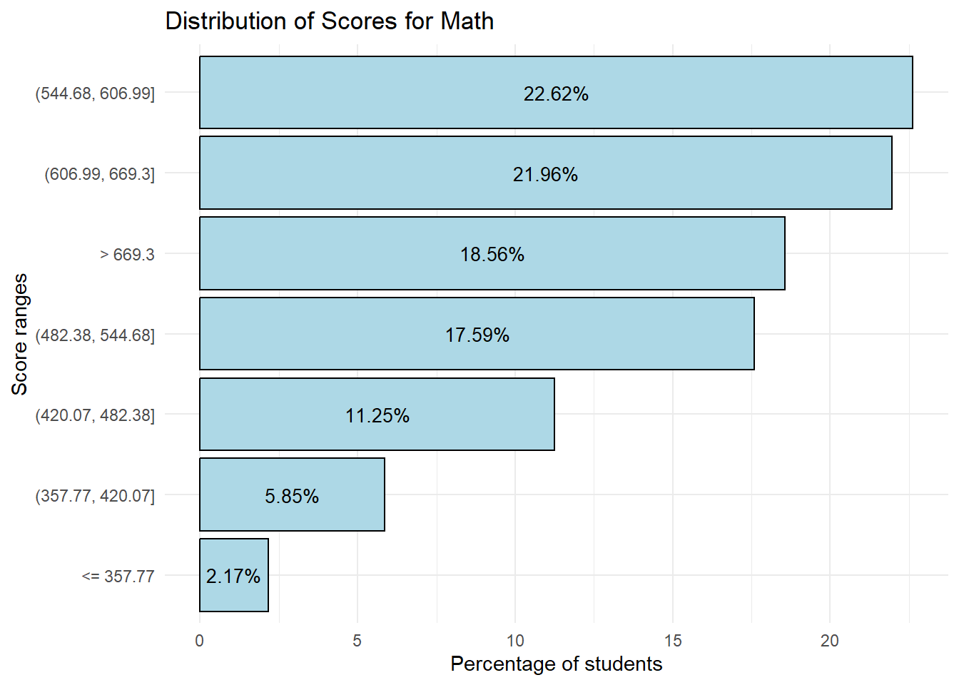
Show the code
library(ggplot2)
library(forcats)

ggplot(Read_Breakdown, aes(x = Percentage, y = fct_reorder(Benchmarks, Percentage))) +
  geom_bar(stat = "identity", fill = "lightgreen", color = "black") +
  geom_text(aes(label = sprintf("%.2f%%", Percentage)), # This adds the labels
            position = position_stack(vjust = 0.5), # Adjust vertical position
            color = "black", # Text color
            size = 3.5) + # Text size, adjust as needed
  labs(
    title = "Distribution of Scores for Reading",
    x = "Percentage of students",
    y = "Score ranges"
  ) +
  theme_minimal()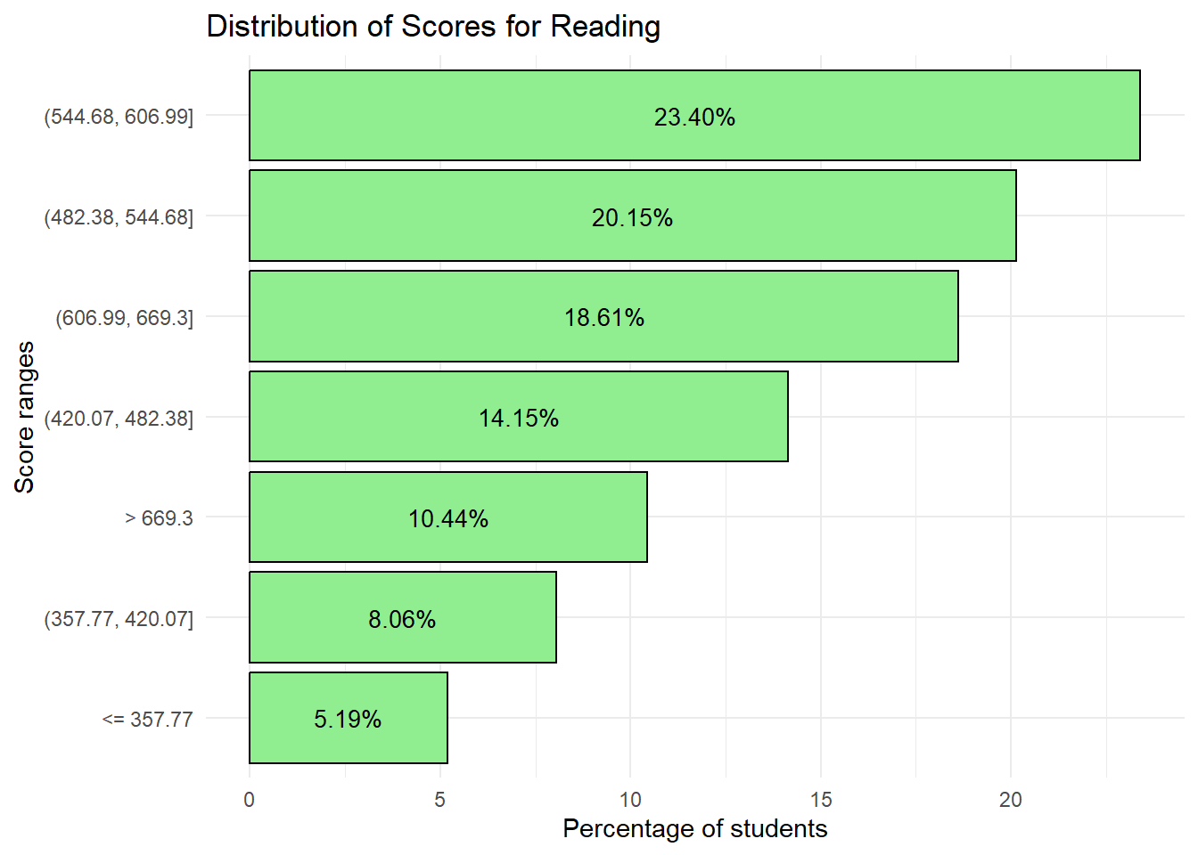
Show the code
library(ggplot2)
library(forcats)

ggplot(Scie_Breakdown, aes(x = Percentage, y = fct_reorder(Benchmarks, Percentage))) +
  geom_bar(stat = "identity", fill = "lightpink", color = "black") +
  geom_text(aes(label = sprintf("%.2f%%", Percentage)), # This adds the labels
            position = position_stack(vjust = 0.5), # Adjust vertical position
            color = "black", # Text color
            size = 3.5) + # Text size, adjust as needed
  labs(
    title = "Distribution of Scores for Science",
    x = "Percentage of students",
    y = "Score ranges"
  ) +
  theme_minimal()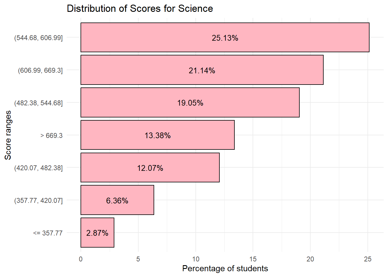
Next, we can combine these tables and plots into one plot to show the percentage of students per Score Range for all subjects.
Show the code
# Creating a new combined table

Math_Breakdown$Subject <- 'Math'
Read_Breakdown$Subject <- 'Reading'
Scie_Breakdown$Subject <- 'Science'

Combined_Breakdown <- bind_rows(Math_Breakdown, Read_Breakdown, Scie_Breakdown)
The code below enables us to plot the breakdown of scores for all subjects.
Show the code
# Order the Benchmarks factor based on the order it appears in the dataset
Combined_Breakdown <- Combined_Breakdown %>%
  mutate(Benchmarks = fct_inorder(Benchmarks))

# Now plot using ggplot
p <- ggplot(Combined_Breakdown, aes(x = Benchmarks, y = Percentage, fill = Subject)) +
  geom_bar(stat = "identity", position = position_dodge(width = 0.9)) +  # Dodge position for the bars
  geom_text(
    aes(label = sprintf("%.1f%%", Percentage)),  # This will format the label to have 1 decimal place and a percentage sign
    position = position_dodge(width = 0.9),  # Match the position of the text with the dodged bars
    vjust = -0.25,
    size = 2
  ) +
  scale_fill_manual(values = c("Math" = "lightblue", "Reading" = "lightgreen", "Science" = "lightpink")) +
  labs(title = "For lower Score ranges, students seem to do better in Reading",
       x = "Score Range",
       y = "Percentage of Students") +
  theme_minimal() +
  theme(axis.text.x = element_text(angle = 45, hjust = 1))

# Convert to interactive plotly object
p_interactive <- ggplotly(p, tooltip = c("x", "y", "fill", "text"))

# Print the interactive plot
p_interactive
Observation 7
1) 63.14 % of students scored 544.68 and above for Math
2) 52.45% of students scored 544.68 and above for Reading
3) 59.65 % of students scored 544.68 and above for Science
If we were to select a baseline score as 544.68, we can see that students generally do better in Math relative to Science and Reading.
While individual plots are useful to visualize the break down of students across scores, we can also combine them into a single bar plot to obtain insights on relative performance. From the combined plot, we can see that at lower score ranges, students seem to do better in Reading relative to Math and Science. However, at higher score ranges, students do worse in Reading relative to Math and Science.
3) Violin plots for Gender performance across subjects
Previously we had used box plots to visualize the difference in performance between the genders across subjects. The code below ‘switches’ to violin plots instead.
Show the code
# Create the plot using the subset_data
vx_plot1 <- ggplot(subset_gender_PV1, aes(x = ST004D01T, y = PV1MATH, fill = ST004D01T)) +
  geom_violin(trim = FALSE) + # Use geom_violin instead of geom_boxplot
  geom_point(data = Math_gender, aes(x = ST004D01T, y = Mean), color = "black", size = 1.5) +
  geom_text(data = Math_gender, aes(x = ST004D01T, y = Mean, label = round(Mean, 2)),
            color = "black", vjust = -0.5, size = 3.5) +
  labs(x = "Gender", y = "PV1 Math Score") +
  scale_fill_manual(values = c("Female" = "lightblue", "Male" = "lightblue")) +
  theme_minimal() +
  theme(legend.position = "none") # Remove the legend

vx_plot2 <- ggplot(subset_gender_PV1, aes(x = ST004D01T, y = PV1READ, fill = ST004D01T)) +
  geom_violin(trim = FALSE) + # Use geom_violin instead of geom_boxplot
  geom_point(data = Read_gender, aes(x = ST004D01T, y = Mean), color = "black", size = 1.5) +
  geom_text(data = Read_gender, aes(x = ST004D01T, y = Mean, label = round(Mean, 2)),
            color = "black", vjust = -0.5, size = 3.5) +
  labs(x = "Gender", y = "PV1 Reading Score") +
  scale_fill_manual(values = c("Female" = "lightgreen", "Male" = "lightgreen")) +
  theme_minimal() +
  theme(legend.position = "none") # Remove the legend

vx_plot3 <- ggplot(subset_gender_PV1, aes(x = ST004D01T, y = PV1SCIE, fill = ST004D01T)) +
  geom_violin(trim = FALSE) + # Use geom_violin instead of geom_boxplot
  geom_point(data = SCIE_gender, aes(x = ST004D01T, y = Mean), color = "black", size = 1.5) +
  geom_text(data = SCIE_gender, aes(x = ST004D01T, y = Mean, label = round(Mean, 2)),
            color = "black", vjust = -0.5, size = 3.5) +
  labs(x = "Gender", y = "PV1 Science Score") +
  scale_fill_manual(values = c("Female" = "lightpink", "Male" = "lightpink")) +
  theme_minimal() +
  theme(legend.position = "none") # Remove the legend
We will use the code below to do a composite plot for all 3 subjects
Show the code
patch5 <- vx_plot1 + vx_plot2 + vx_plot3 +
              plot_annotation(
                title = "Male students outperform in Maths and Science")

patch5 & theme( axis.text.y = element_blank(),panel.grid.major = element_blank(),)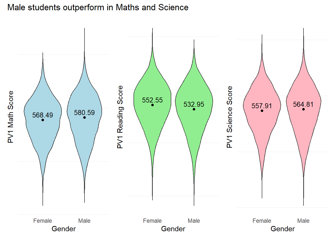
Note
Violin plots may provide a fuller picture of the data distribution, revealing density and multimodality that box plots may obscure. This could be useful for detecting data patterns and clusters.
Violin plots could also emphasize the concentration of data points and potential outliers, showcasing the entire range of the data including peaks, valleys, and tails that may not be evident from box plots.
4) Relationship between Scores and the times spent on studying or homework before or after school
The objective of this visualization is to examine the relationship between student scores and the time spent on studying or on homework (STUDYHMW).
The variable “STUDYHMW” measures how many times during a typical school week students studied for school or homework before going to school and/or after leaving school. Values on this index range from 0 (no studying) to 10 (10 or more times of studying per week).
First we check for any missing values in the STUDYHMW column using the code below.
# Check for NAs in the 'STUDYHMW' column
has_nas <- any(is.na(stu_qqq_SG$STUDYHMW))

print(has_nas)
[1] TRUESince there are missing values in the STUDYHMW column, we shall delete the rows with missing values. We will then create a new table with STUDYHMW and the Mean scores of the 10 Plausible Values for this visualization.
The pisa.mean.pv() function from the instvy package enables us to calculate the mean scores from the 10 Plausible Values and enables us to further group by the time spent on studying (STUDYHMW).
In the code below, we will create separate tables for the mean scores for each subject.
Show the code
homework_math <- pisa.mean.pv(pvlabel = paste0("PV",1:10,"MATH"), by = "STUDYHMW", data = stu_qqq_SG)

homework_read <- pisa.mean.pv(pvlabel = paste0("PV",1:10,"READ"), by = "STUDYHMW", data = stu_qqq_SG)

homework_scie <- pisa.mean.pv(pvlabel = paste0("PV",1:10,"SCIE"), by = "STUDYHMW", data = stu_qqq_SG)
We examine the new tables created.
print(homework_math) STUDYHMW Freq Mean s.e. SD s.e
1 0 274 514.96 7.21 111.29 4.17
2 1 154 537.23 9.42 112.48 6.16
3 2 422 540.72 5.89 110.16 3.82
4 3 500 566.21 4.89 105.07 3.27
5 4 602 569.18 4.54 104.79 3.12
6 5 1750 616.13 2.13 90.56 1.64
7 6 568 551.80 4.29 103.99 3.02
8 7 415 577.30 4.96 97.93 3.69
9 8 416 561.92 4.83 94.31 3.86
10 9 163 554.53 8.07 91.50 5.98
11 10 1296 570.87 2.45 95.76 2.11
12 <NA> 46 486.26 11.65 77.81 8.28Since there 46 rows with missing values, we will delete the rows with missing values.
homework_math <- na.omit(homework_math)
homework_read <- na.omit(homework_read)
homework_scie <- na.omit(homework_scie)
Next, we can combine these tables to be able to plot one graph to show the mean scores across the time spent on homework and studying, for all subjects.
homework_math$Subject <- 'Math'
homework_read$Subject <- 'Reading'
homework_scie$Subject <- 'Science'

Combined_homework <- bind_rows(homework_math, homework_read, homework_scie)
The code below enables us to plot the breakdown of scores for all subjects.
Show the code
# Order the Benchmarks factor based on the order it appears in the dataset
Combined_homework <- Combined_homework %>%
  mutate(STUDYHMW = fct_inorder(STUDYHMW))

# Now plot using ggplot
p2 <- ggplot(Combined_homework, aes(x = STUDYHMW, y = Mean, fill = Subject)) +
  geom_bar(stat = "identity", position = "dodge") +
  scale_fill_manual(values = c("Math" = "lightblue", "Reading" = "lightgreen", "Science" = "lightpink")) +
  labs(title = "Students who study more may not necessarily score higher",
       x = "Number of times in a week",
       y = "Mean Scores") +
  theme_minimal()

# Convert to interactive plotly object
p_interactive2 <- ggplotly(p2, tooltip = c("x", "y", "fill", "text"))

# Print the interactive plot
p_interactive2
Observation 8
From the combined plot, it appears that the optimal number of times to study in a week is 5 times for all subjects. More times spent on homework and/or studying does not seem to translate to higher scores for this PISA test. However this factor alone is insufficient to conclude causality, and we should do additional analysis on other factors that may impact a student’s ability to prepare for this test.