pacman::p_load(tidyverse, haven, ggdist, ggridges, ggthemes,
colorspace)Take-home Exercise 1a- 5 EDAs
Setting the Scene
OECD education director Andreas Schleicher shared in a BBC article that “Singapore managed to achieve excellence without wide differences between children from wealthy and disadvantaged families.” (2016) Furthermore, several of Singapore’s ministers for Education also started an “every school a good school” slogan. The general public, however, believes that there are still disparities that exist, especially between “elite” and neighborhood schools, between students from families with higher socioeconomic status and those with relatively lower socioeconomic status and immigration and non-immigration families.
The Task
The 2022 Programme for International Student Assessment (PISA) data was released on December 5, 2022. PISA’s global education survey runs every three years to assess education systems worldwide through the testing 15 year old students in the subjects of mathematics, reading, and science.
In this take-home exercise, we will use appropriate Exploratory Data Analysis (EDA) methods and ggplot2 functions to reveal:
the distribution of Singapore students’ performance in mathematics, reading, and science, and
the relationship between these performances with schools, gender and socioeconomic status of the students.
Getting Started
Loading R packages
Importing the Data
stu_qqq_SG <- read_rds("data/stu_qqq_SG.rds")Loading the instvy package.
# install.packages("intsvy",repos = "http://cran.us.r-project.org")

library("intsvy")
Extracting the overall student mean score values for each subject
Math_mean_SG <- pisa.mean.pv(pvlabel = paste0("PV",1:10,"MATH"), by="CNT", data=stu_qqq_SG)

Read_mean_SG <- pisa.mean.pv(pvlabel = paste0("PV",1:10,"READ"), by="CNT", data=stu_qqq_SG)

SCIE_mean_SG <- pisa.mean.pv(pvlabel = paste0("PV",1:10,"SCIE"), by="CNT", data=stu_qqq_SG)
1) Distribution of scores in the student cohort
We will use the code below to plot histograms to show the distribution of scores across the 3 subjects.
Show the code
# Create the histogram plot with an annotated mean line using Math_mean_SG
plt1 <- ggplot(stu_qqq_SG, aes(x = PV1MATH)) +
  geom_histogram(binwidth = 20, color = "white", fill='lightblue') +
  labs(x = "Math Scores",
       y = "Count") +
  geom_vline(xintercept = Math_mean_SG$Mean,
             col = 'black',
             size = 0.5,
             linetype = "dashed") +
  geom_text(aes(x = Math_mean_SG$Mean, y = 100, label = paste("Mean =", round(Math_mean_SG$Mean, 2))),
            color = "black", hjust = -0.1, vjust = 1.0) +  # Adjust label position
  theme_minimal()

# Create the histogram plot with an annotated mean line using Read_mean_SG
plt2 <- ggplot(stu_qqq_SG, aes(x = PV1READ)) +
  geom_histogram(binwidth = 20, color = "white", fill='lightgreen') +
  labs(x = "Reading Scores",
       y = "Count") +
  geom_vline(xintercept = Read_mean_SG$Mean,
             col = 'black',
             size = 0.5,
             linetype = "dashed") +
  geom_text(aes(x = Read_mean_SG$Mean, y = 100, label = paste("Mean =", round(Read_mean_SG$Mean, 2))),
            color = "black", hjust = -0.1, vjust = 1.0) +  # Adjust label position
  theme_minimal()


# Create the histogram plot with an annotated mean line using Science_mean_SG
plt3 <- ggplot(stu_qqq_SG, aes(x = PV1SCIE)) +
  geom_histogram(binwidth = 20, color = "white", fill='lightpink') +
  labs(x = "Science Scores",
       y = "Count") +
  geom_vline(xintercept = SCIE_mean_SG$Mean,
             col = 'black',
             size = 0.5,
             linetype = "dashed") +
  geom_text(aes(x = SCIE_mean_SG$Mean, y = 100, label = paste("Mean =", round(SCIE_mean_SG$Mean, 2))),
            color = "black", hjust = -0.1, vjust = 1.0) +  # Adjust label position
  theme_minimal()

# Create a single plot with density plots for Math, Reading, and Science scores
plt4 <- ggplot(stu_qqq_SG, aes(x = PV1MATH, fill = "Math")) +
  geom_density(alpha = 0.5) +
  geom_density(data = stu_qqq_SG, aes(x = PV1READ, fill = "Reading"), alpha = 0.5) +
  geom_density(data = stu_qqq_SG, aes(x = PV1SCIE, fill = "Science"), alpha = 0.5) +
  labs(x = "Subject Scores",
       y = "Density") +
  scale_fill_manual(values = c("Math" = "lightblue", "Reading" = "lightgreen", "Science" = "lightpink")) +
  guides(fill = FALSE) +  # Remove the legend
  theme_minimal()
We use the code below to create a composite plot.
Show the code
library(patchwork)

patch1 <- (plt1+plt2) / (plt3+plt4)  +
              plot_annotation(
                title = "Distribution of student performance in Math, Reading and Science")

patch1 & theme( axis.text.y = element_blank(),panel.grid.major = element_blank(),)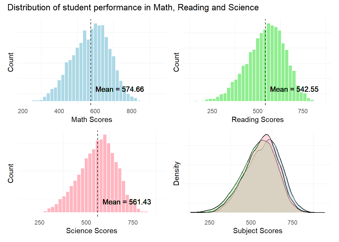
Observation 1
The distribution of scores seem to resemble a normal distribution across all 3 subjects. Singaporean students seem to have a higher mean score In Mathematics relative to Reading and Science.
Further statistical tests like the Anderson-Darling or Shapiro-Wilk tests will need to be conducted to confirm the normality in distribution.
2) Relationship between Scores and School ID
The pisa.mean.pv() function from the instvy package enables us to calculate the mean scores from the 10 Plausible Values and enables us to further group by the School ID (CNTSCHID).
In the code below, we will create separate tables for the mean scores for each subject by different School Ids.
Schoolid_math <- pisa.mean.pv(pvlabel = paste0("PV",1:10,"MATH"), by = "CNTSCHID", data = stu_qqq_SG)

Schoolid_read <- pisa.mean.pv(pvlabel = paste0("PV",1:10,"READ"), by = "CNTSCHID", data = stu_qqq_SG)

Schoolid_scie <- pisa.mean.pv(pvlabel = paste0("PV",1:10,"SCIE"), by = "CNTSCHID", data = stu_qqq_SG)
Next, we use the below code to plot bubble plots to examine the number of students and their mean scores for each school. We will also use the plotly package for added interactivity.
Show the code
library(plotly)

best_sch_math <- Schoolid_math %>% filter(Mean == max(Mean))
worst_sch_math <- Schoolid_math %>% filter(Mean == min(Mean))


p_1 <- ggplot(Schoolid_math, aes(x = CNTSCHID, y = Mean)) +
  geom_point(aes(size = Freq, color = Freq), alpha = 0.5) +
  scale_size_area(max_size = 10) +
  scale_color_gradient(low = "skyblue", high = "darkblue") +
  labs(title = "Mean Math Scores per School",
    y = "Mean Math Scores",
    size = "Number of Students",
    color = "Number of Students") +
  theme_minimal() +
  theme(axis.text.x = element_blank(),
        axis.ticks.x = element_blank(),
        axis.title.x = element_blank(),
        panel.grid.major = element_blank(),  # Remove major grid lines
        panel.grid.minor = element_blank())  # Remove minor grid lines

# Annotate the best and worst mean scores
p_1 <- p_1 +
  geom_text(data = best_sch_math, aes(label = "Best", y = Mean + 12), vjust = 1, hjust=-1) +
  geom_text(data = worst_sch_math, aes(label = "Worst", y = Mean - 12), vjust = 1)


# Convert to an interactive plot
ggplotly(p_1, tooltip = c("x", "y", "size", "color"))
Show the code
best_sch_read <- Schoolid_read %>% filter(Mean == max(Mean))
worst_sch_read <- Schoolid_read %>% filter(Mean == min(Mean))

p_2 <- ggplot(Schoolid_read, aes(x = CNTSCHID, y = Mean)) +
  geom_point(aes(size = Freq, color = Freq), alpha = 0.5) +
  scale_size_area(max_size = 10) +
  scale_color_gradient(low = "yellow", high = "darkorchid") +
  labs(title = "Mean Reading Scores per School",
    y = "Mean Reading Scores",
    size = "Number of Students",
    color = "Number of Students") +
  theme_minimal() +
  theme(axis.text.x = element_blank(),
        axis.ticks.x = element_blank(),
        axis.title.x = element_blank(),
        panel.grid.major = element_blank(),  # Remove major grid lines
        panel.grid.minor = element_blank())  # Remove minor grid lines

# Annotate the best and worst mean scores
p_2 <- p_2 +
  geom_text(data = best_sch_read, aes(label = "Best", y = Mean + 12), vjust = 1, hjust=-1) +
  geom_text(data = worst_sch_read, aes(label = "Worst", y = Mean - 12), vjust = 1)

# Convert to an interactive plot
ggplotly(p_2, tooltip = c("x", "y", "size", "color"))
Show the code
best_sch_scie <- Schoolid_scie %>% filter(Mean == max(Mean))
worst_sch_scie <- Schoolid_scie %>% filter(Mean == min(Mean))


p_3 <- ggplot(Schoolid_scie, aes(x = CNTSCHID, y = Mean)) +
  geom_point(aes(size = Freq, color = Freq), alpha = 0.5) +
  scale_size_area(max_size = 10) +
  scale_color_gradient(low = "lightpink", high = "darkred") +
  labs(title = "Mean Science Scores per School",
    y = "Mean Science Scores",
    size = "Number of Students",
    color = "Number of Students") +
  theme_minimal() +
  theme(axis.text.x = element_blank(),
        axis.ticks.x = element_blank(),
        axis.title.x = element_blank(),
        panel.grid.major = element_blank(),  # Remove major grid lines
        panel.grid.minor = element_blank())  # Remove minor grid lines

# Annotate the best and worst mean scores
p_3 <- p_3 +
  geom_text(data = best_sch_scie, aes(label = "Best", y = Mean + 12), vjust = 1, hjust=-1) +
  geom_text(data = worst_sch_scie, aes(label = "Worst", y = Mean - 12), vjust = 1)

# Convert to an interactive plot
ggplotly(p_3, tooltip = c("x", "y", "size", "color"))
Observation 2
The ability to extract and assign Mean scores to individual schools enables us to further explore and examine the disparity in performance between schools. For example, looking at the two extremes of score results, we note that Schools (70200001 & 70200003) out perform other schools in Math and Science. On the other hand, Schools (7020115 & 70200149) under perform other schools in Math and Science.
This seems to indicate that there are still marked differences between the ‘’best” schools and the’‘worst’’ schools. Additional analysis could be done to identify the differences between these two sets of schools in terms of resources, teaching quality, and students attitudes or motivation etc, in order to fully understand the reason behind the difference in the scores.
3) Relationship Between Gender and Scores
First we create a subset of Gender and PV1 scores using the below code. We also convert the levels from 1 and 2, to Female and Male respectively.
# Create a subset of the data with gender and PV1 score columns
subset_gender_PV1 <- stu_qqq_SG %>%
  select(ST004D01T, PV1MATH, PV1SCIE, PV1READ)

# Convert the "ST004D01T" column to a factor
subset_gender_PV1$ST004D01T <- factor(subset_gender_PV1$ST004D01T, levels = c(1, 2), labels = c("Female", "Male"))
Next we plot the ridgeline plots with quantile lines.
Show the code
rp1 <- ggplot(subset_gender_PV1,
       aes(x = PV1MATH,
           y = ST004D01T,
           fill = factor(stat(quantile))
           )) +
  stat_density_ridges(
    geom = "density_ridges_gradient",
    calc_ecdf = TRUE,
    quantiles = 4,
    quantile_lines = TRUE) +
  scale_fill_viridis_d(name = "Quartiles") +
  scale_x_continuous(
    name = "Math Scores",
    expand = c(0, 0)
    ) +
  scale_y_discrete(name = NULL, expand = expansion(add = c(0.2, 2.6))) +
  theme_ridges() +
  theme(legend.position = "none")

rp2 <- ggplot(subset_gender_PV1,
       aes(x = PV1READ,
           y = ST004D01T,
           fill = factor(stat(quantile))
           )) +
  stat_density_ridges(
    geom = "density_ridges_gradient",
    calc_ecdf = TRUE,
    quantiles = 4,
    quantile_lines = TRUE) +
  scale_fill_viridis_d(name = "Quartiles") +
  scale_x_continuous(
    name = "Reading Scores",
    expand = c(0, 0)
    ) +
  scale_y_discrete(name = NULL, expand = expansion(add = c(0.2, 2.6))) +
  theme_ridges() +
  theme(legend.position = "none")

rp3 <- ggplot(subset_gender_PV1,
       aes(x = PV1SCIE,
           y = ST004D01T,
           fill = factor(stat(quantile))
           )) +
  stat_density_ridges(
    geom = "density_ridges_gradient",
    calc_ecdf = TRUE,
    quantiles = 4,
    quantile_lines = TRUE) +
  scale_fill_viridis_d(name = "Quartiles") +
  scale_x_continuous(
    name = "Science Scores",
    expand = c(0, 0)
    ) +
  scale_y_discrete(name = NULL, expand = expansion(add = c(0.2, 2.6))) +
  theme_ridges() +
  theme(legend.position = "none")
We use the code below to create a composite plot via patchwork
Show the code
library(patchwork)

patch6 <- rp1 / rp2 / rp3 +
              plot_annotation(
                title = "Male students seem to perform better in Math and Science")

patch6 & theme(panel.grid.major = element_blank(),)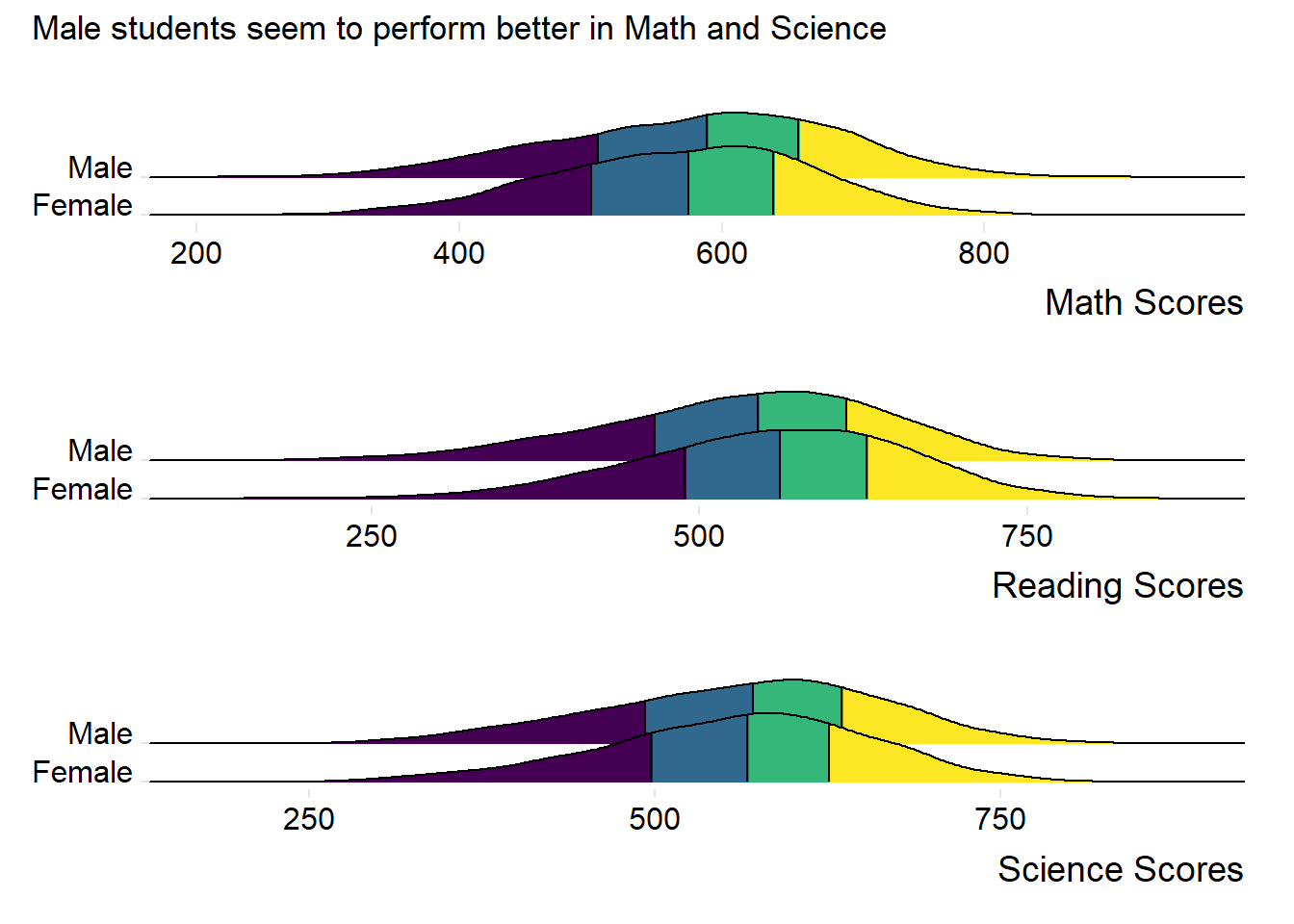
Observation 3
Males students seem to outperform Female students in both Maths and Science. Female students seem to outperform Male students in Reading.
4) Relationship between Scores and Socioeconomic status of students
We will create a new subset with ESCS and the PV1 scores for this visualization.
subset_ESCS_PV1 <- stu_qqq_SG %>%
  select(ESCS, PV1MATH, PV1SCIE, PV1READ)

#omiting NA values
subset_ESCS_PV1 <- na.omit(subset_ESCS_PV1)
Using our new table subset_ESCS_PV1, we will create scatter plots for ESCS versus each PV1 score for each subject using the code below.
Show the code
c_coeff_ESCS_Math <- cor(subset_ESCS_PV1$ESCS, subset_ESCS_PV1$PV1MATH)

C_plt1 <- ggplot(subset_ESCS_PV1, aes(x = ESCS, y = PV1MATH)) +
  geom_point(color = "lightblue") +
  geom_smooth(method = "lm", formula = y ~ x, color = "black") +
  geom_text(
    x = max(subset_ESCS_PV1$ESCS),
    y = max(subset_ESCS_PV1$PV1MATH),
    label = paste("Corr Coeff:", round(c_coeff_ESCS_Math, 2)),
    hjust = 1,  # Adjust horizontal justification
    vjust = 1   # Adjust vertical justification
  ) +
  labs(x = "Socio-Economic Status (ESCS)",
    y = "Math Scores") +
  theme_minimal()

c_coeff_ESCS_Read <- cor(subset_ESCS_PV1$ESCS, subset_ESCS_PV1$PV1READ)

C_plt2 <- ggplot(subset_ESCS_PV1, aes(x = ESCS, y = PV1READ)) +
  geom_point(color = "lightgreen") +
  geom_smooth(method = "lm", formula = y ~ x, color = "black") +
  geom_text(
    x = max(subset_ESCS_PV1$ESCS),
    y = max(subset_ESCS_PV1$PV1READ),
    label = paste("Corr Coeff:", round(c_coeff_ESCS_Read, 2)),
    hjust = 1,  # Adjust horizontal justification
    vjust = 1   # Adjust vertical justification
  ) +
  labs(x = "Socio-Economic Status (ESCS)",
    y = "Reading Scores") +
  theme_minimal()

c_coeff_ESCS_Scie <- cor(subset_ESCS_PV1$ESCS, subset_ESCS_PV1$PV1SCIE)

C_plt3 <- ggplot(subset_ESCS_PV1, aes(x = ESCS, y = PV1SCIE)) +
  geom_point(color = "lightpink") +
  geom_smooth(method = "lm", formula = y ~ x, color = "black") +
  geom_text(
    x = max(subset_ESCS_PV1$ESCS),
    y = max(subset_ESCS_PV1$PV1SCIE),
    label = paste("Corr Coeff:", round(c_coeff_ESCS_Scie, 2)),
    hjust = 1,  # Adjust horizontal justification
    vjust = 1   # Adjust vertical justification
  ) +
  labs(x = "Socio-Economic Status (ESCS)",
       y = "Science Scores") +
  theme_minimal()
We will use patchwork to create a composite plot for our scatter plots.
Show the code
patch4 <- C_plt1 / C_plt2 / C_plt3 +
              plot_annotation(
                title = "Weak positive relationship between Scores and ESCS")

patch4 & theme( axis.text.y = element_blank(),panel.grid.major = element_blank(),)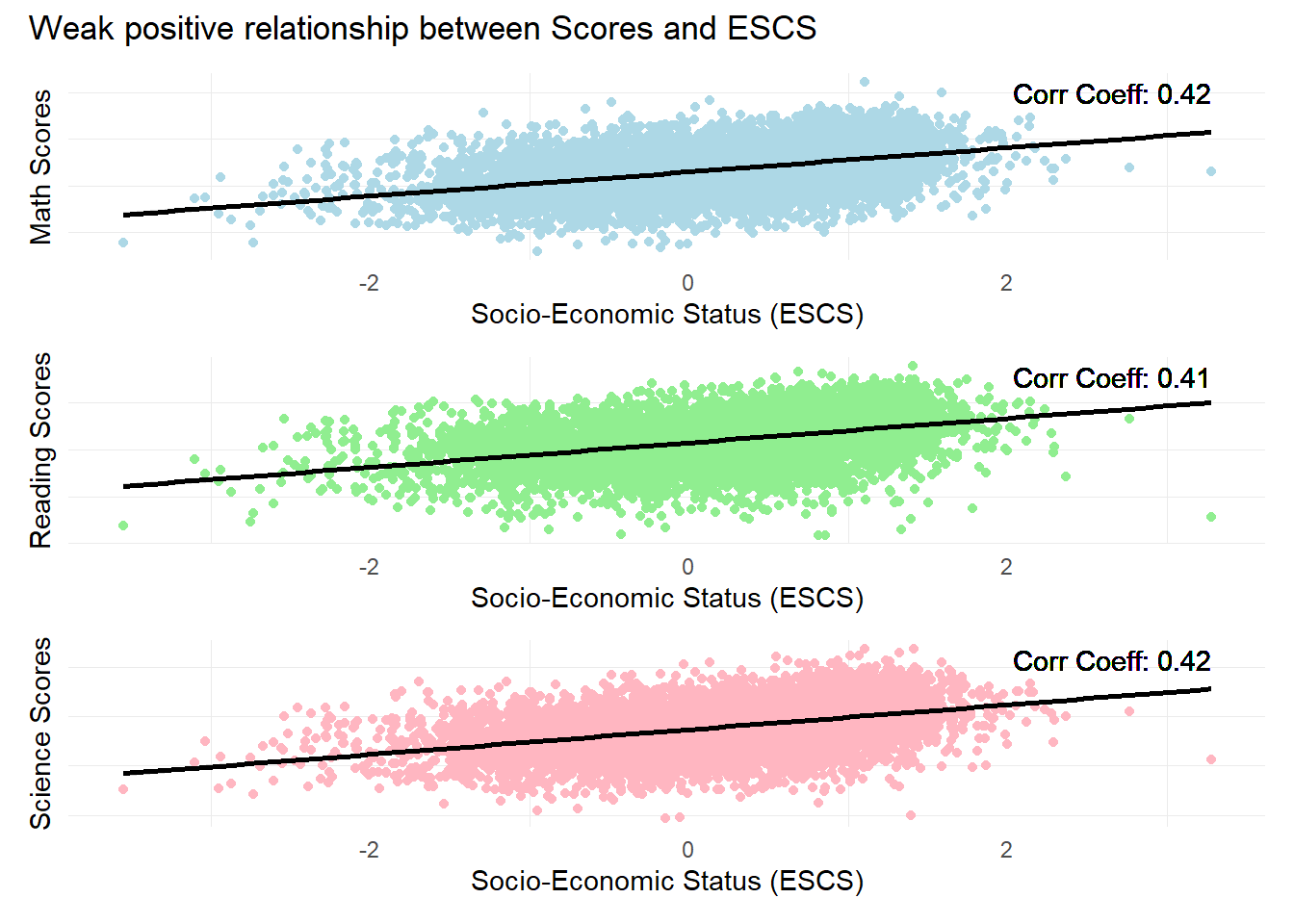
Observation 4
There is a weak positive relationship between subject scores and Socioeconomic statuses. The ESCS score is a composite score calculated from three indicators: highest parental occupation status (HISEI), highest education of parents in years (PAREDINT), and home possessions (HOMEPOS).
Further analysis could be conducted on the individual components of the ESCS score to check for their individual influence on student performance.
5) Examining the Breakdown of scores per Subject
We can further examine the percentage of students per score range for each subject. This might help us examine whether there are specific strengths or weaknesses in the student cohort.
First, we use the pisa.ben.pv() function from the instvy package which calculates student scores from the 10 plausible values and calculates the percentage of students at each proficiency level (Score range) as defined by PISA.
In the code below, we will create separate tables for the percentage breakdown of scores for each subject.
Show the code
Math_Breakdown <- pisa.ben.pv(pvlabel= paste0("PV",1:10,"MATH"), by="CNT", atlevel=TRUE, data=stu_qqq_SG)

Read_Breakdown <- pisa.ben.pv(pvlabel= paste0("PV",1:10,"READ"), by="CNT", atlevel=TRUE, data=stu_qqq_SG)

Scie_Breakdown <- pisa.ben.pv(pvlabel= paste0("PV",1:10,"SCIE"), by="CNT", atlevel=TRUE, data=stu_qqq_SG)
Next, we can combine these tables and plots into one plot to show the percentage of students per Score Range for all subjects.
Show the code
# Creating a new combined table

Math_Breakdown$Subject <- 'Math'
Read_Breakdown$Subject <- 'Reading'
Scie_Breakdown$Subject <- 'Science'

Combined_Breakdown <- bind_rows(Math_Breakdown, Read_Breakdown, Scie_Breakdown)
The code below enables us to plot the breakdown of scores for all subjects.
Show the code
# Order the Benchmarks factor based on the order it appears in the dataset
Combined_Breakdown <- Combined_Breakdown %>%
  mutate(Benchmarks = fct_inorder(Benchmarks))

# Now plot using ggplot
ggplot(Combined_Breakdown, aes(x = Benchmarks, y = Percentage, fill = Subject)) +
  geom_bar(stat = "identity", position = position_dodge(width = 0.9)) +  # Dodge position for the bars
  geom_text(
    aes(label = sprintf("%.1f%%", Percentage)),  # This will format the label to have 1 decimal place and a percentage sign
    position = position_dodge(width = 0.9),  # Match the position of the text with the dodged bars
    vjust = -0.25,
    size = 2
  ) +
  scale_fill_manual(values = c("Math" = "lightblue", "Reading" = "lightgreen", "Science" = "lightpink")) +
  labs(title = "For lower Score ranges, students seem to do better in Reading",
       x = "Score Range",
       y = "Percentage of Students") +
  theme_minimal() +
  theme(axis.text.x = element_text(angle = 45, hjust = 1))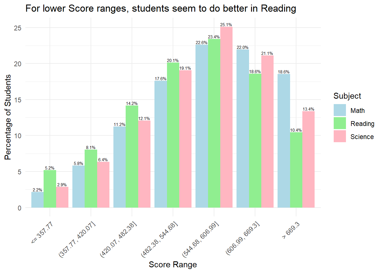
Observation 5
Combined bar plots can allow us to obtain insights on relative performance. For example, for scores below 544.68, we can see that at lower score ranges, students seem to do better in Reading relative to Math and Science. However, at higher score ranges, students do worse in Reading relative to Math and Science.