pacman::p_load(ggrepel, patchwork,
               ggthemes, hrbrthemes,
tidyverse)Hands-on Exercise 2 - Beyond ggplot2 fundamentals
2.1 Overview
In this exercise, we learn several ggplot2 extensions to create more elegant and effective statistical graphics.
Our objectives will be to:-
control the placement of annotations on graphs by using functions in the ggrepel package,
create professional publication quality figures by using functions in the ggthemes and hbrthemes packages,
plot composite figures by combining ggplot2 graphs by using the patchwork package.
2.2 Getting started
2.2.1 Installing and loading the required libraries
Besides tideverse, four R packages will be used.
ggrepel: an R package that provides geoms for ggplot2 to repel overlapping text labels.
ggthemes: an R package that provides some extra themes, geoms, and scales for ‘ggplot2’.
hrbrthemes: an R package that provides typography-centric themes and theme components for ggplot2.
patchwork: an R package for preparing composite figure created using ggplot2.
The code below will be used to check if the packages have been installed and to load them into our R environment.
2.2.2 Importing Data
We will use a data file called Exam_data.csv. It consists of year end examination grades of a cohort of primary 3 students from a local school.
The code below imports exam_data.csv into our R environment by using read_csv() fuction of readr package.
exam_data <- read_csv('data/Exam_data.csv')spec(exam_data)cols(
ID = col_character(),
CLASS = col_character(),
GENDER = col_character(),
RACE = col_character(),
ENGLISH = col_double(),
MATHS = col_double(),
SCIENCE = col_double()
)
Note
we can use spec() to quickly inspect the column specifications for this data set.
There are seven attributes in the exam_data tibble data frame. Four of them are categorical data type and the other three are in continuous data type.
The categorical attributes are: ID, CLASS, GENDER and RACE (datatype = character).
The continuous attributes are: MATHS, ENGLISH and SCIENCE (datatype = double).
We can also use glimpse() to inspect the data frame.
glimpse(exam_data)Rows: 322
Columns: 7
$ ID <chr> "Student321", "Student305", "Student289", "Student227", "Stude…
$ CLASS <chr> "3I", "3I", "3H", "3F", "3I", "3I", "3I", "3I", "3I", "3H", "3…
$ GENDER <chr> "Male", "Female", "Male", "Male", "Male", "Female", "Male", "M…
$ RACE <chr> "Malay", "Malay", "Chinese", "Chinese", "Malay", "Malay", "Chi…
$ ENGLISH <dbl> 21, 24, 26, 27, 27, 31, 31, 31, 33, 34, 34, 36, 36, 36, 37, 38…
$ MATHS <dbl> 9, 22, 16, 77, 11, 16, 21, 18, 19, 49, 39, 35, 23, 36, 49, 30,…
$ SCIENCE <dbl> 15, 16, 16, 31, 25, 16, 25, 27, 15, 37, 42, 22, 32, 36, 35, 45…2.3 Beyond ggplot2 Annotation: ggrepel
Annotations for statistical graphs can be challenging especially with a large number of data points.
Show the code
ggplot(data=exam_data,
       aes(x= MATHS,
           y=ENGLISH)) +
  geom_point() +
  geom_smooth(method=lm,
              size=0.5) +
  geom_label(aes(label = ID),
             hjust = .5,
             vjust = -.5) +
  coord_cartesian(xlim=c(0,100),
                  ylim=c(0,100)) +
  ggtitle("English scores versus Maths scores for Primary 3")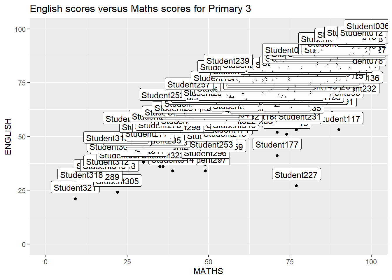
ggrepel is an extension of ggplot2 package which provides geoms for ggplot2 to repel overlapping text labels.
Instead of geom_text(), we can use geom_text_repel().
Instead of geom_label(), we can use geom_label_repel().
These new text labels repel away from each other, away from data points, and away from edges of the plotting area.
2.3.1 Working with ggrepel
Show the code
ggplot(data=exam_data,
       aes(x= MATHS,
           y=ENGLISH)) +
  geom_point() +
  geom_smooth(method=lm,
              size=0.5) +
  geom_label_repel(aes(label = ID),
                   fontface = "bold") +
  coord_cartesian(xlim=c(0,100),
                  ylim=c(0,100)) +
  ggtitle("English scores versus Maths scores for Primary 3")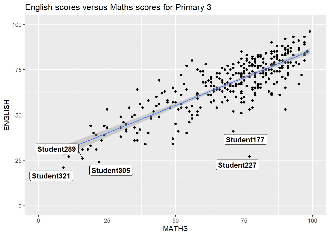
2.4 Beyond ggplot2 themes
ggplot2 comes with eight built-in themes:-
theme_gray()theme_bw()theme_classic()theme_dark()theme_light()theme_linedraw()theme_minimal()theme_void()
Show the code
ggplot(data=exam_data,
             aes(x = MATHS)) +
  geom_histogram(bins=20,
                 boundary = 100,
                 color="grey25",
                 fill="grey90") +
  theme_gray() +
ggtitle("Distribution of Maths scores") 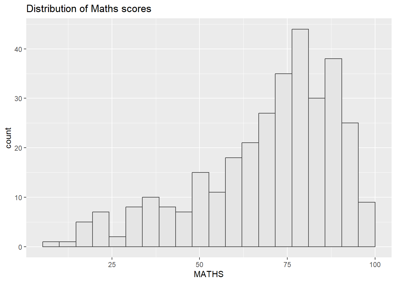
Show the code
ggplot(data=exam_data,
             aes(x = MATHS)) +
  geom_histogram(bins=20,
                 boundary = 100,
                 color="grey25",
                 fill="grey90") +
  theme_bw() +
ggtitle("Distribution of Maths scores") 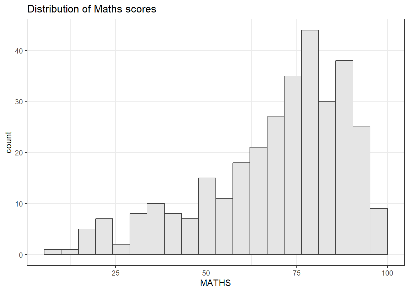
Show the code
ggplot(data=exam_data,
             aes(x = MATHS)) +
  geom_histogram(bins=20,
                 boundary = 100,
                 color="grey25",
                 fill="grey90") +
  theme_classic() +
ggtitle("Distribution of Maths scores") 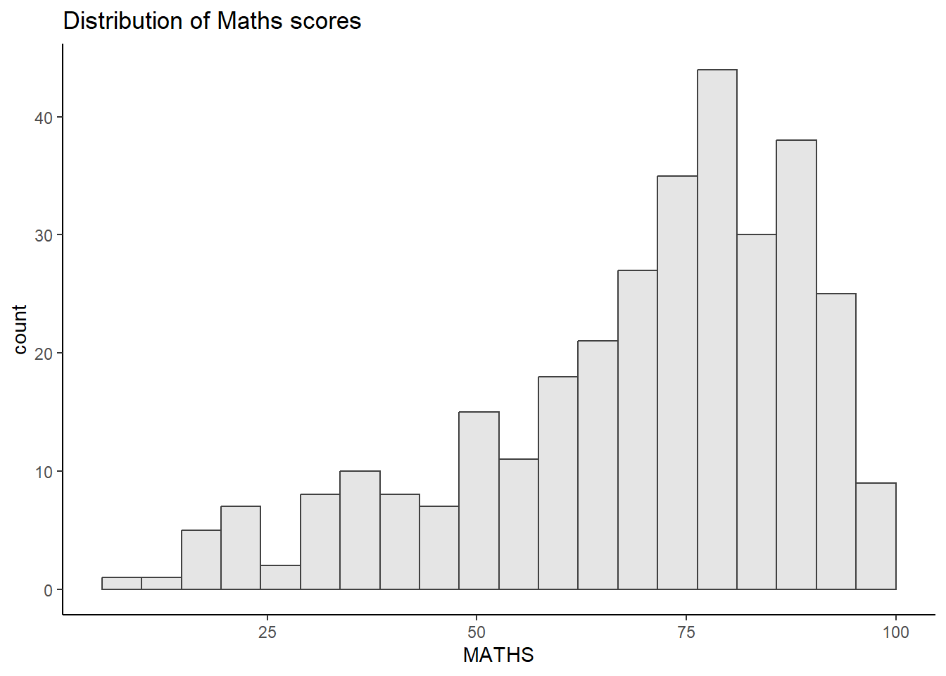
Show the code
ggplot(data=exam_data,
             aes(x = MATHS)) +
  geom_histogram(bins=20,
                 boundary = 100,
                 color="grey25",
                 fill="grey90") +
  theme_dark() +
ggtitle("Distribution of Maths scores") 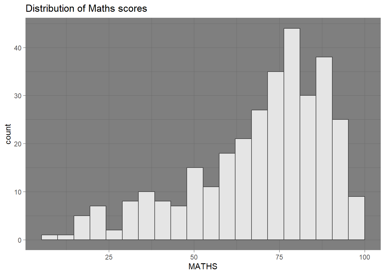
Show the code
ggplot(data=exam_data,
             aes(x = MATHS)) +
  geom_histogram(bins=20,
                 boundary = 100,
                 color="grey25",
                 fill="grey90") +
  theme_light() +
ggtitle("Distribution of Maths scores") 
Show the code
ggplot(data=exam_data,
             aes(x = MATHS)) +
  geom_histogram(bins=20,
                 boundary = 100,
                 color="grey25",
                 fill="grey90") +
  theme_linedraw() +
ggtitle("Distribution of Maths scores") 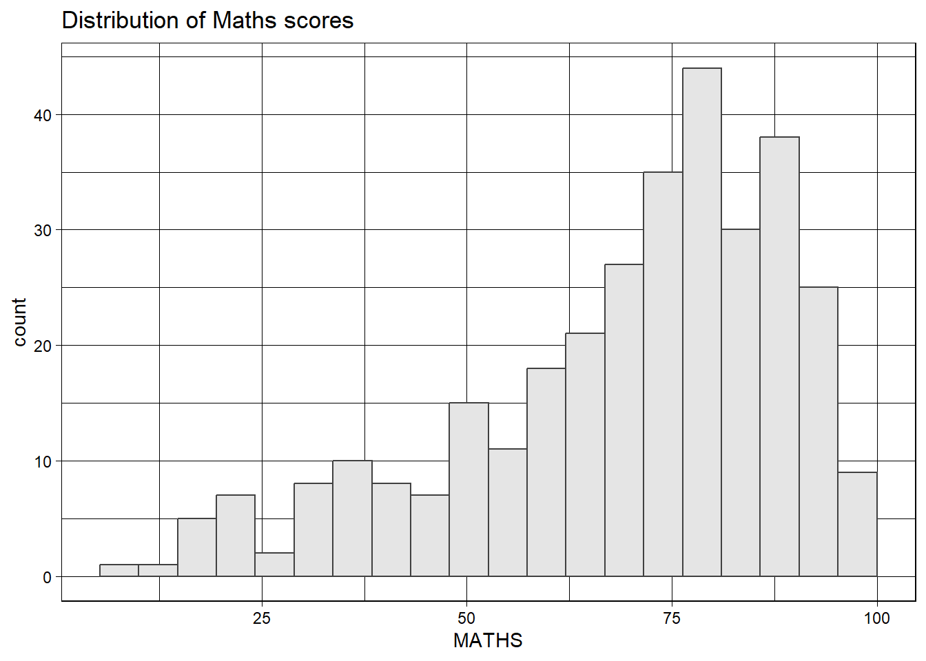
Refer to this link to learn more about ggplot2 Themes.
2.4.1 Working with ggtheme package
ggthemes provides ggplot2 themes that replicate the look of plots by the likes of Edward Tufte, Stephew few, The economist and The wall street journal among others. It also provides some extra geoms and scales for ‘ggplot2’.
Below are some examples of the different themes available.
Show the code
ggplot(data=exam_data,
             aes(x = MATHS)) +
  geom_histogram(bins=20,
                 boundary = 100,
                 color="grey25",
                 fill="grey90") +
  ggtitle("Distribution of Maths scores") +
  theme_wsj()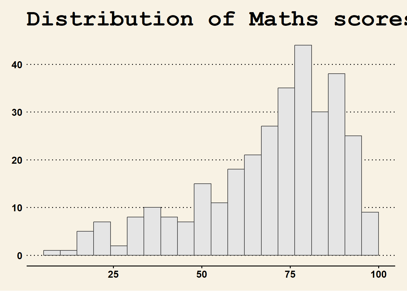
Show the code
ggplot(data=exam_data,
             aes(x = MATHS)) +
  geom_histogram(bins=20,
                 boundary = 100,
                 color="grey25",
                 fill="grey90") +
  ggtitle("Distribution of Maths scores") +
  theme_fivethirtyeight()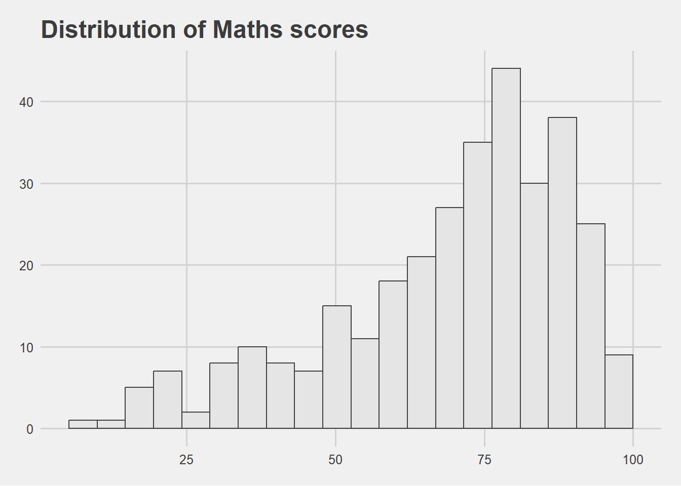
Show the code
ggplot(data=exam_data,
             aes(x = MATHS)) +
  geom_histogram(bins=20,
                 boundary = 100,
                 color="grey25",
                 fill="grey90") +
  ggtitle("Distribution of Maths scores") +
  theme_economist()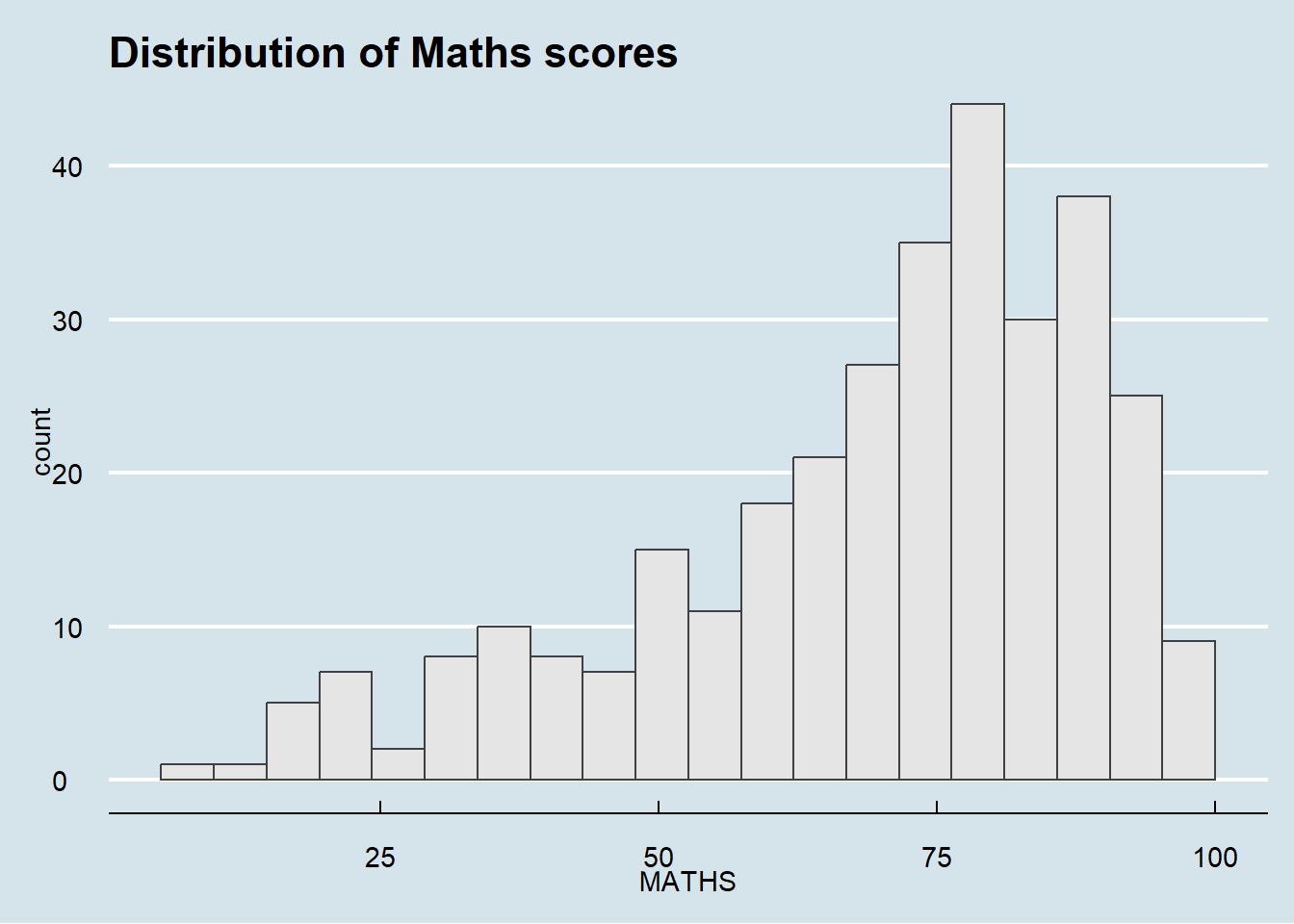
2.4.2 Working with hrbthemes package
hrbthemes package provides typography centric themes and theme components for ggplot2. This includes where labels are placed and the fonts used.
Show the code
ggplot(data=exam_data,
             aes(x = MATHS)) +
  geom_histogram(bins=20,
                 boundary = 100,
                 color="grey25",
                 fill="grey90") +
  ggtitle("Distribution of Maths scores") +
  theme_ipsum()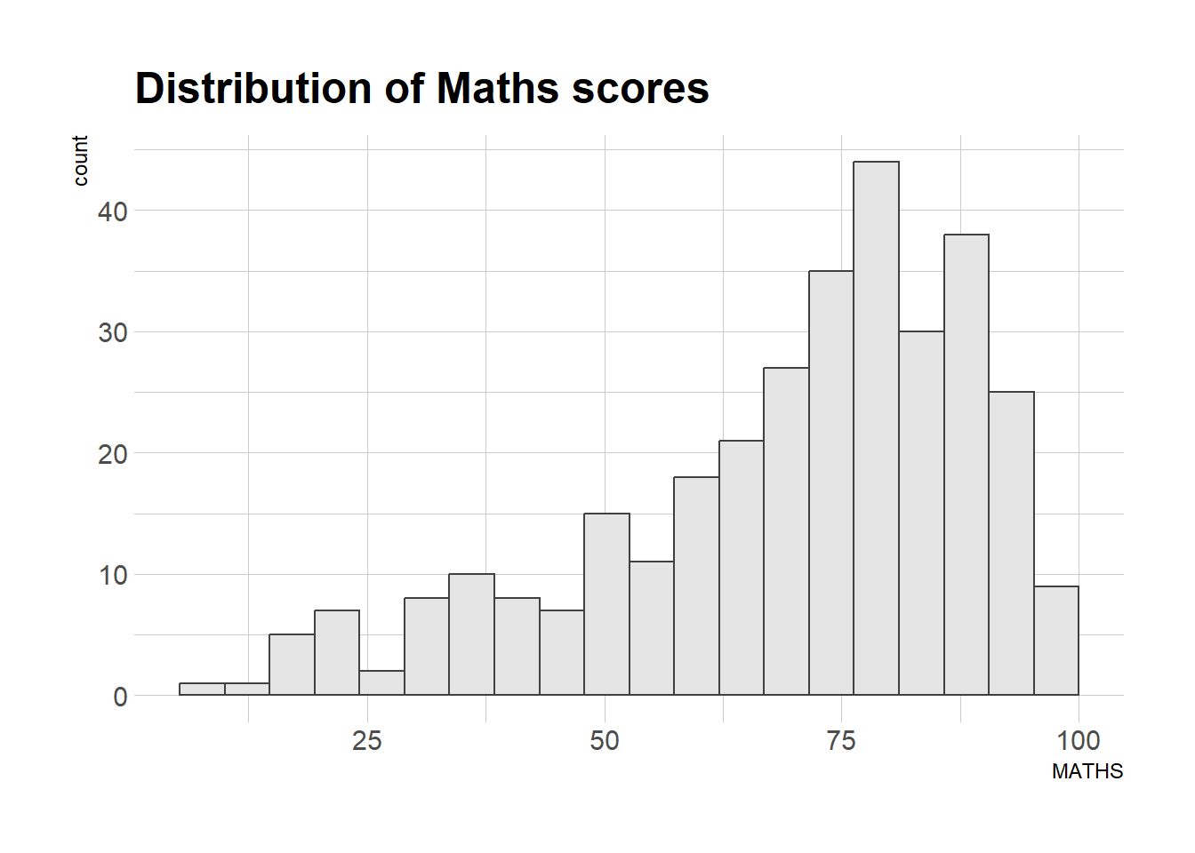
The second goal centers around productivity for a production workflow. In fact, this “production workflow” is the context for where the elements of hrbrthemes should be used. Consult this vignette to learn more.
Show the code
ggplot(data=exam_data,
             aes(x = MATHS)) +
  geom_histogram(bins=20,
                 boundary = 100,
                 color="grey25",
                 fill="grey90") +
  ggtitle("Distribution of Maths scores") +
  theme_ipsum(axis_title_size = 18,
              base_size = 15,
              grid = "Y")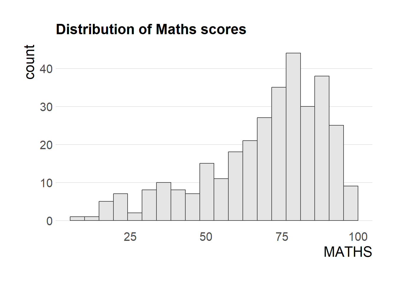
Note
What we can learn from the code chunk above?
axis_title_sizeargument is used to increase the font size of the axis title to 18,base_sizeargument is used to increase the default axis label to 15, andgridargument is used to remove the x-axis grid lines.
2.5 Beyond a single graph
It is not unusual that multiple graphs are required to tell a compelling visual story. There are several ggplot2 extensions that provide functions to compose figures with multiple graphs.
In this section, we learn how to create a composite plot by combining multiple graphs. First, we create three statistical graphics by using the codes below.
Show the code
plot1 <- ggplot(data=exam_data,
             aes(x = MATHS)) +
  geom_histogram(bins=20,
                 boundary = 100,
                 color="grey25",
                 fill="grey90") +
  coord_cartesian(xlim=c(0,100)) +
  ggtitle("Distribution of Maths scores")

plot1
Show the code
plot2 <- ggplot(data=exam_data,
             aes(x = ENGLISH)) +
  geom_histogram(bins=20,
                 boundary = 100,
                 color="grey25",
                 fill="grey90") +
  coord_cartesian(xlim=c(0,100)) +
  ggtitle("Distribution of English scores")

plot2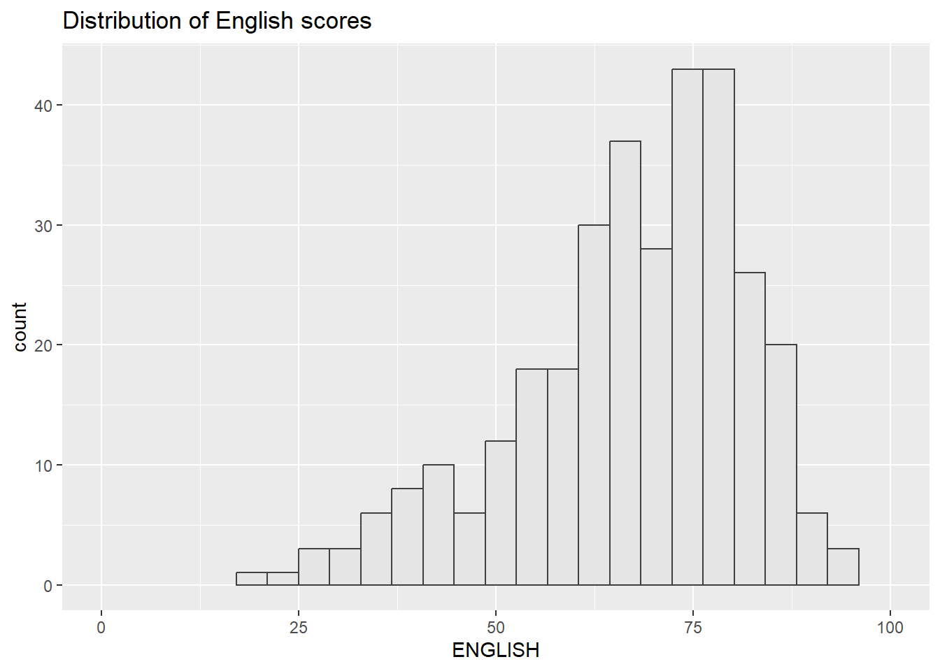
Show the code
plot3 <- ggplot(data=exam_data,
             aes(x= MATHS,
                 y=ENGLISH)) +
  geom_point() +
  geom_smooth(method=lm,
              size=0.5) +
  coord_cartesian(xlim=c(0,100),
                  ylim=c(0,100)) +
  ggtitle("English scores versus Maths\nscores for Primary 3")

plot3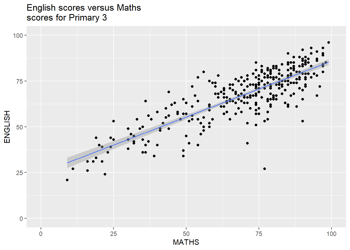
2.5.1 Creating Composite Graphics: patchwork method
There are several ggplot2 extension’s functions that support the preparation of composite figures such as grid.arrange() of gridExtra package and plot_grid() of cowplot package.
In this section, we will use a ggplot2 extension called patchwork which is specially designed for combining separate ggplot2 graphs into a single figure.
Patchwork package has a simple syntax where we can create layouts easily. Here’s the general syntax that combines:
Two-Column Layout using the Plus Sign +.
Parenthesis () to create a subplot group.
Two-Row Layout using the Division Sign
/
2.5.2 Combining two ggplot2 graphs
The tabset below shows a composite of two histograms created using patchwork along with the corresponding codes.
plot1+plot2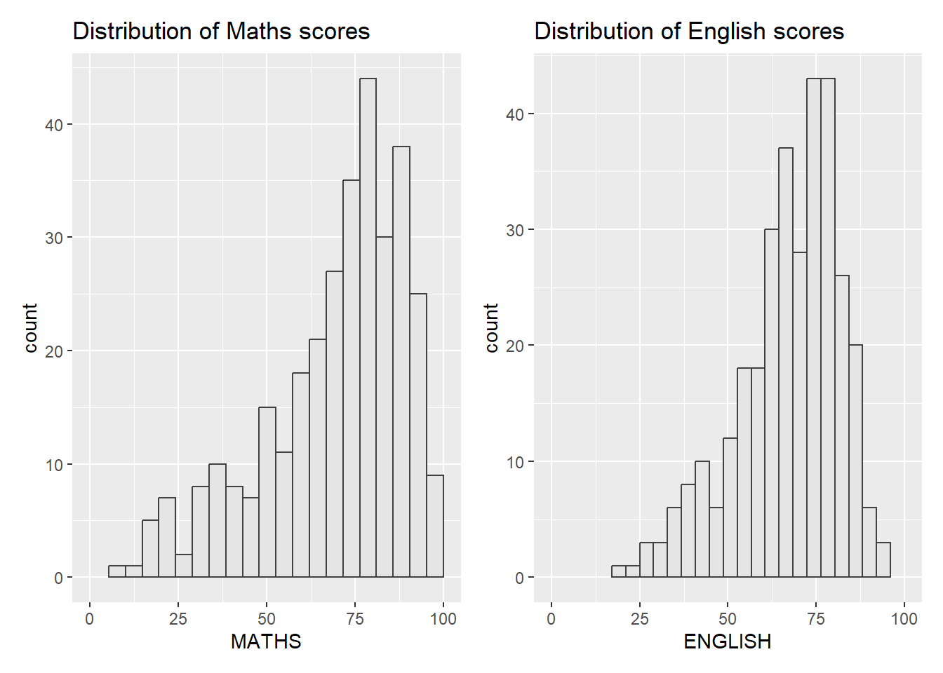
plot1/plot2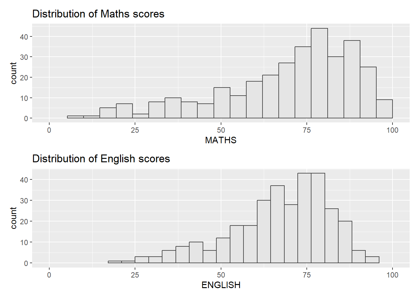
plot1 + plot2 + plot_layout(ncol=2,widths=c(2,1))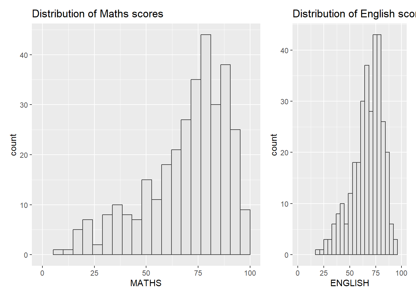
2.5.3 Combining 3 ggplot2 graphs
We can plot more complex composite figures by using appropriate operators.
The composite figure below was plotted using
“|” operator to stack two ggplot2 graphs,
“/” operator to place the plots beside each other,
“()” operator the define the sequence of the plotting.
(plot1 / plot2) | plot3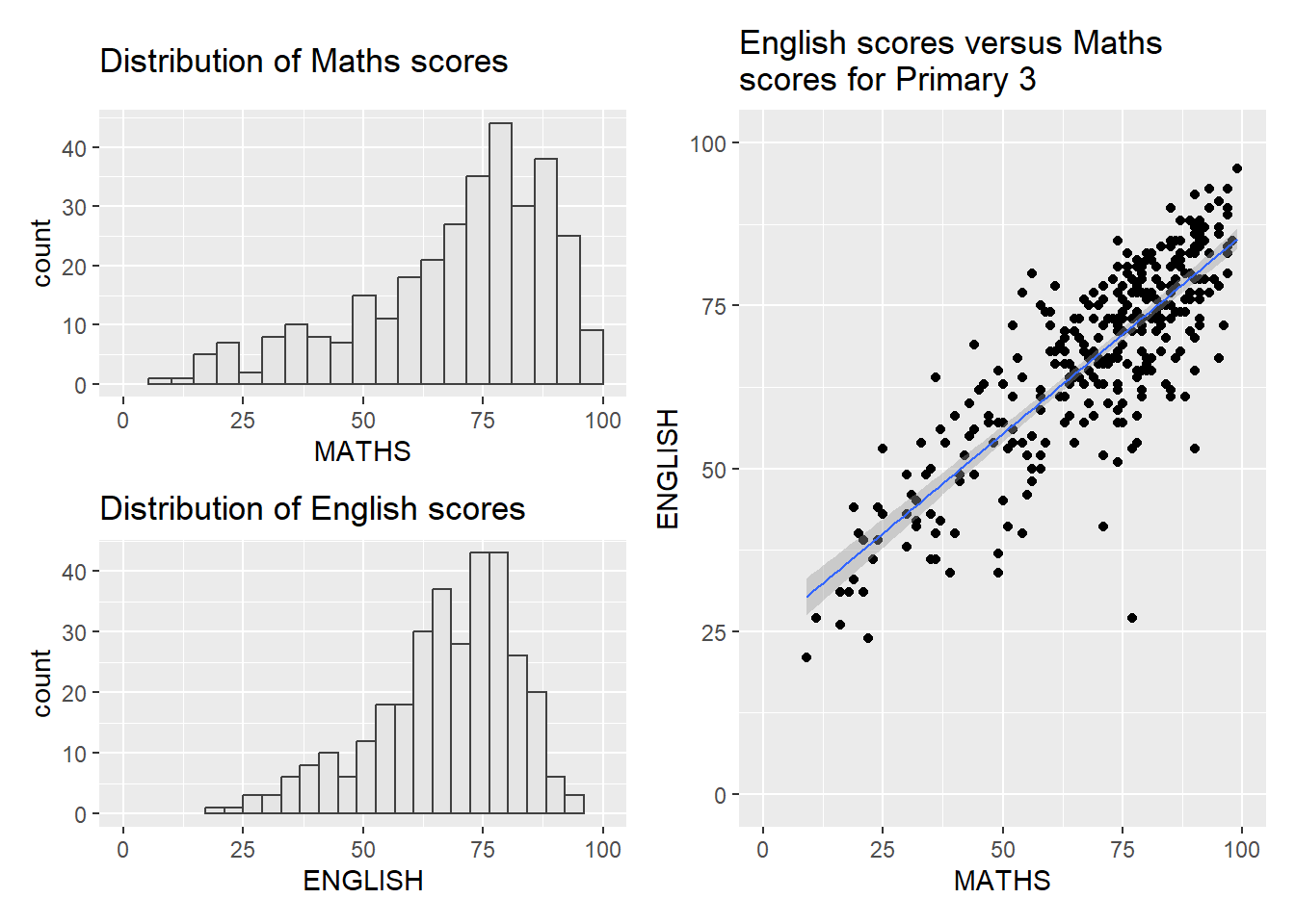
To learn more about patchwork, please refer to this link.
2.5.4 Creating a composite figure with tags
In order to identify subplots in text, patchwork also provides auto-tagging capabilities as shown in the figure below.
((plot1 / plot2) | plot3) +
  plot_annotation(tag_levels = 'I')
((plot1 / plot2) | plot3) +
  plot_annotation(tag_levels = '1')
((plot1 / plot2) | plot3) +
  plot_annotation(tag_levels = 'A')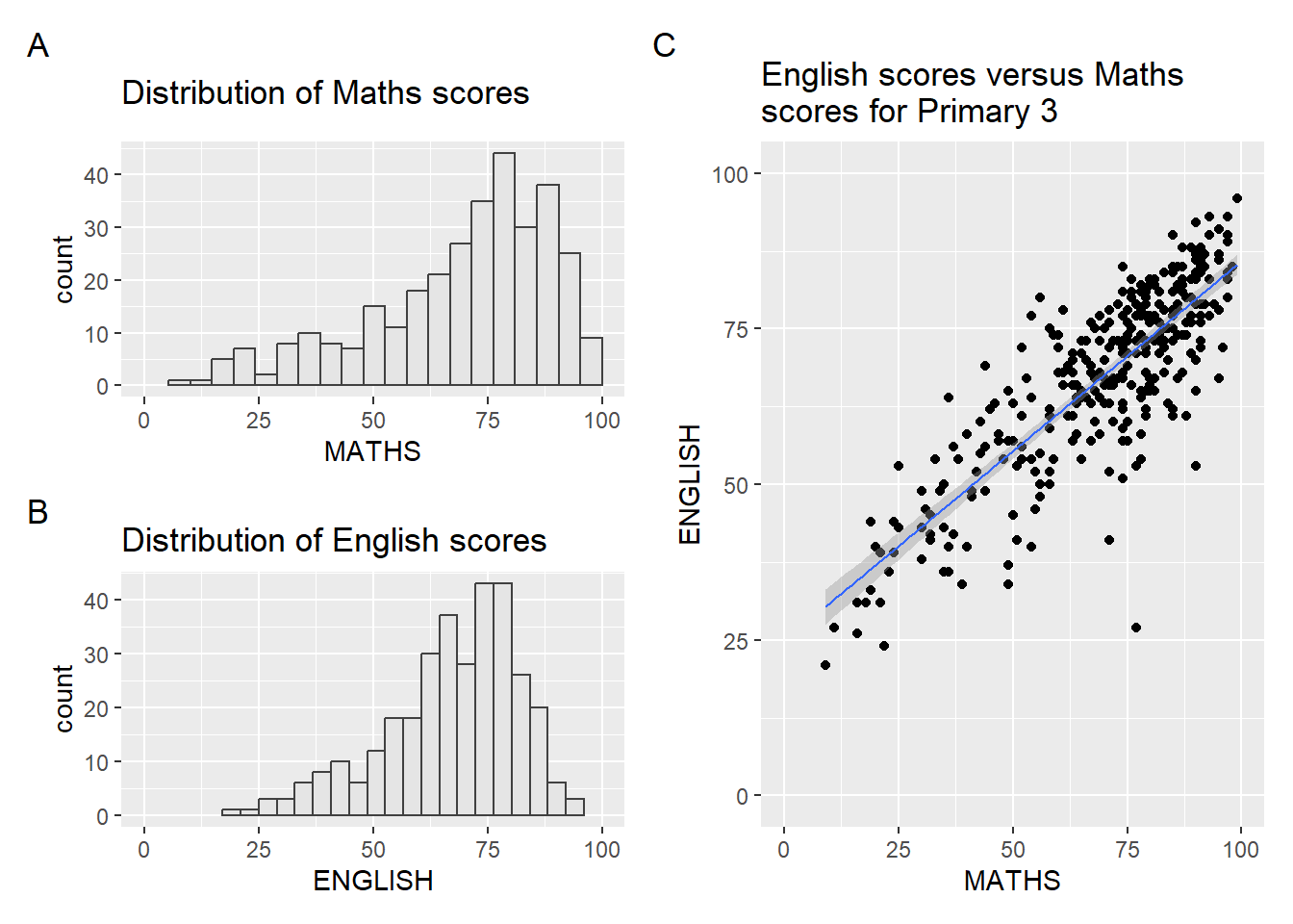
2.5.5 Creating figures with insert
Besides providing functions to place plots next to each other, we can also use the function inset_element() to place one or several plots or graphic elements within another plot.
plot3 + inset_element(plot2,
                   left = 0.02,
                   bottom = 0.7,
                   right = 0.5,
                   top = 1)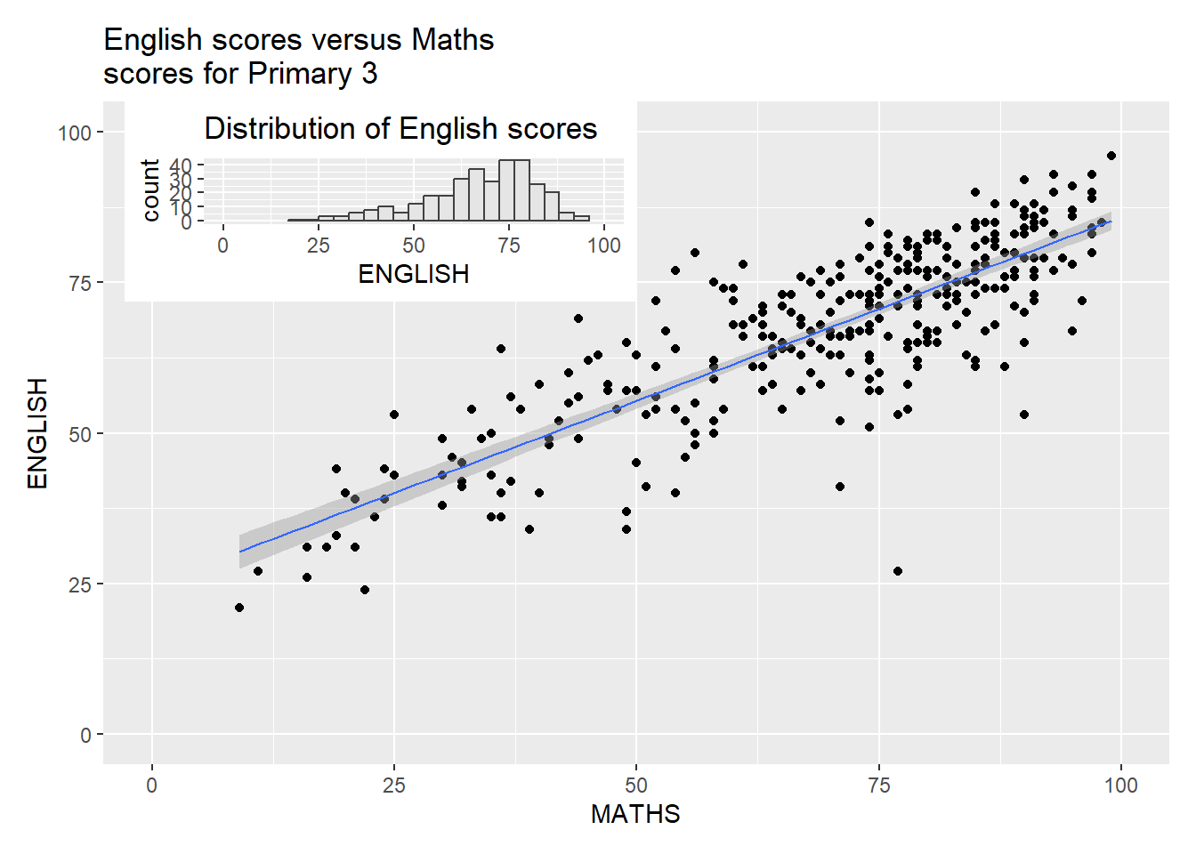
2.5.6 Creating a composite figure by using patchwork and ggtheme
The figure below is created by combining patchwork and theme_economist() of the ggthemes package.
Show the code
patchwork <- (plot1 / plot2) | plot3
patchwork & theme_economist()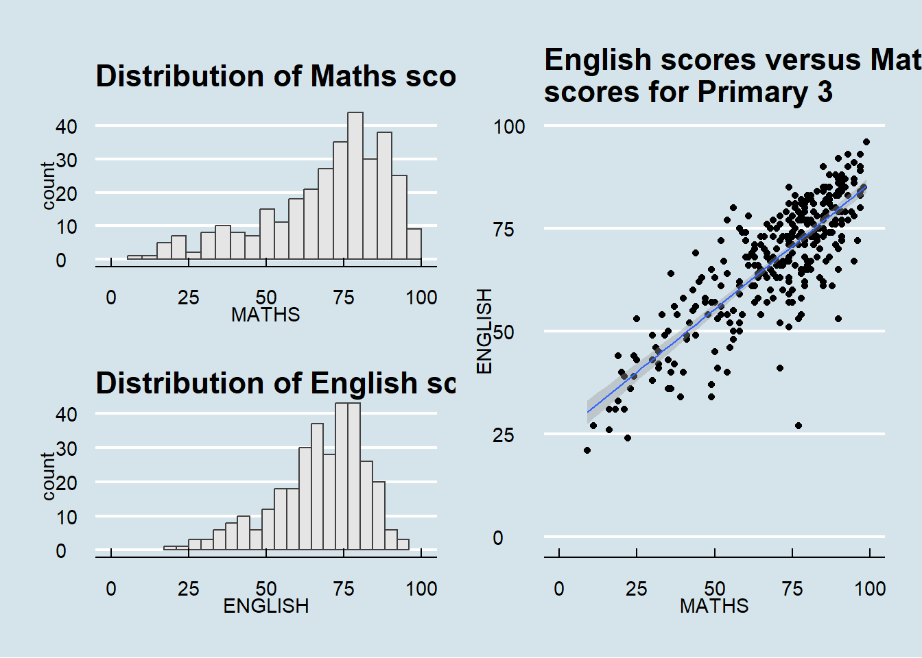
2.6 Plotting Practice
- Changing themes, plot and axis title sizes
Show the code
patchwork <- (plot1 / plot2) | plot3

patchwork & theme_fivethirtyeight() +
  theme(plot.title=element_text(size =10),
        axis.title.y=element_text(size = 9,
                              angle = 0,
                              vjust=0.9),
        axis.title.x=element_text(size = 9))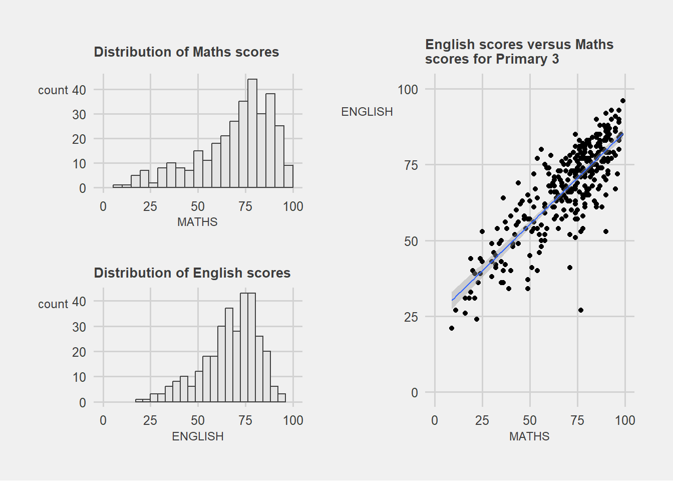
Show the code
patchwork <- (plot1 / plot2) | plot3

patchwork & theme_economist() +
  theme(plot.title=element_text(size =10),
        axis.title.y=element_text(size = 9,
                              angle = 0,
                              vjust=0.9),
        axis.title.x=element_text(size = 9))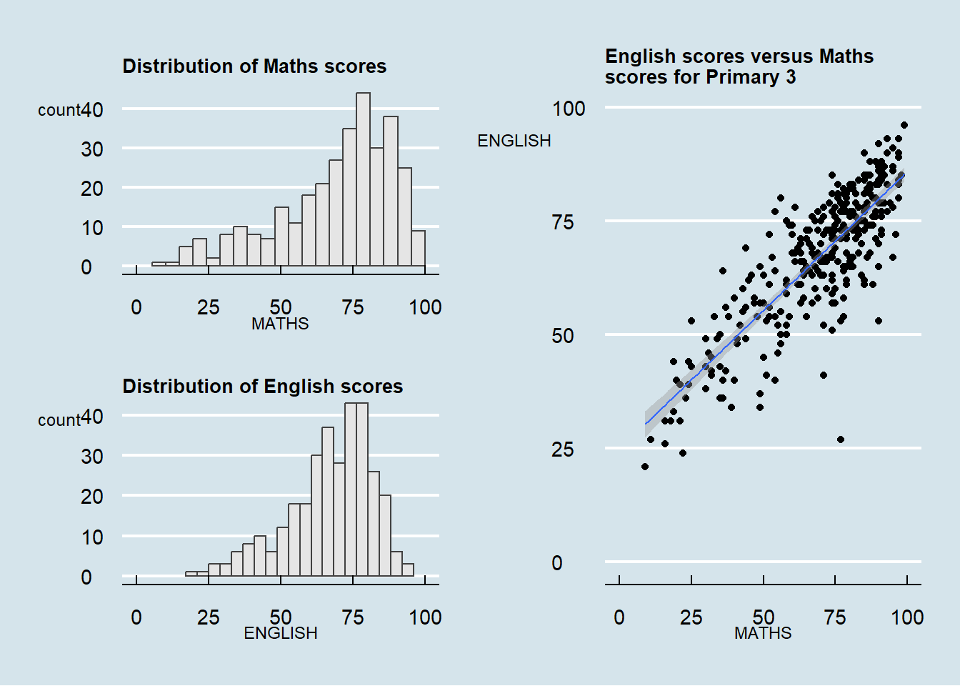
Show the code
patchwork <- (plot1 / plot2) | plot3

patchwork & theme_wsj() +
  theme(plot.title=element_text(size =10),
        axis.title.y=element_text(size = 9,
                              angle = 0,
                              vjust=0.9),
        axis.title.x=element_text(size = 9))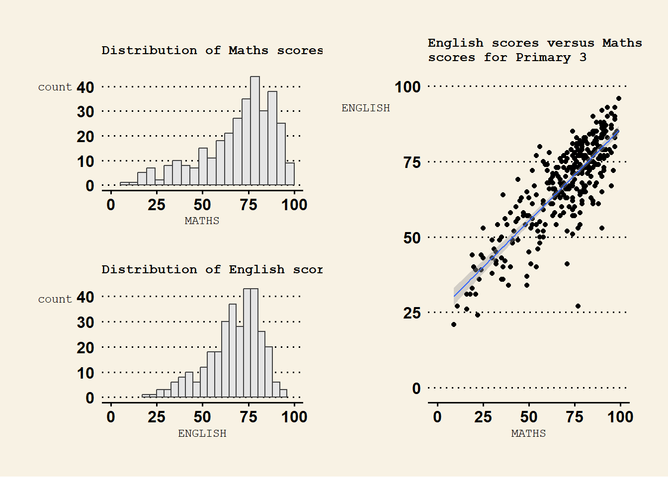
Note
To customize individual plot’s text sizes or orientation, we will need to change the respective codes for each plot seperately,